
Client: John Lewis
Role: Senior UX/UI Designer
Duration: 4 Months
Tools: Pen & Paper, Figma, Google analytics, Content square, Miro, Dovetail
Responsibilities: User Interviews / Facilitated Stakeholder meetings / User Journeys / Empathy mapping / Contextual interviews / Information Architecture / Site Mapping / Competitive & Comparative analysis / Content auditing / Presentation scriptwriting & design / User Testing / Low & High Fidelity Wire-framing prototyping / Data Analysis / New component builds for design system.
The John Lewis Partnership is the UK's largest employee owned business and is a frontrunner in providing good quality and cost efficient products.
The John Lewis Partnership is unique in that it is owned by its employees, who are referred to as "partners."
The company operates two major retail chains: John Lewis & Partners, which sells a wide range of products including clothing, furniture, and electronics; and Waitrose & Partners, a supermarket chain that specializes in high-quality groceries. In addition to these retail operations, the John Lewis Partnership also operates financial services and insurance businesses.
The John Lewis Partnership has a reputation for high-quality products and excellent customer service. It has won numerous awards for its retail operations and is often held up as an example of a successful employee-owned company.
The Client
The Challange
With the cost of living crisis in full swing and the impact of global warning, there is a pressing need for consumers to be able to compare products that not only save money but also helps them make sustainable choices when purchasing household products.
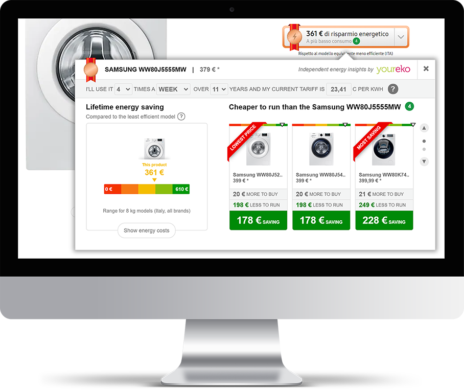
Youreko, is an energy savings tool that can be accessed as an extension in your browser which then runs a comparison check in the back end for the most energy and cost effective products across the market.
Our brief was to review the current YourEko tool, find the user painpoints and redesign the User interface so it fits more inline with the John Lewis design system.
The Solution
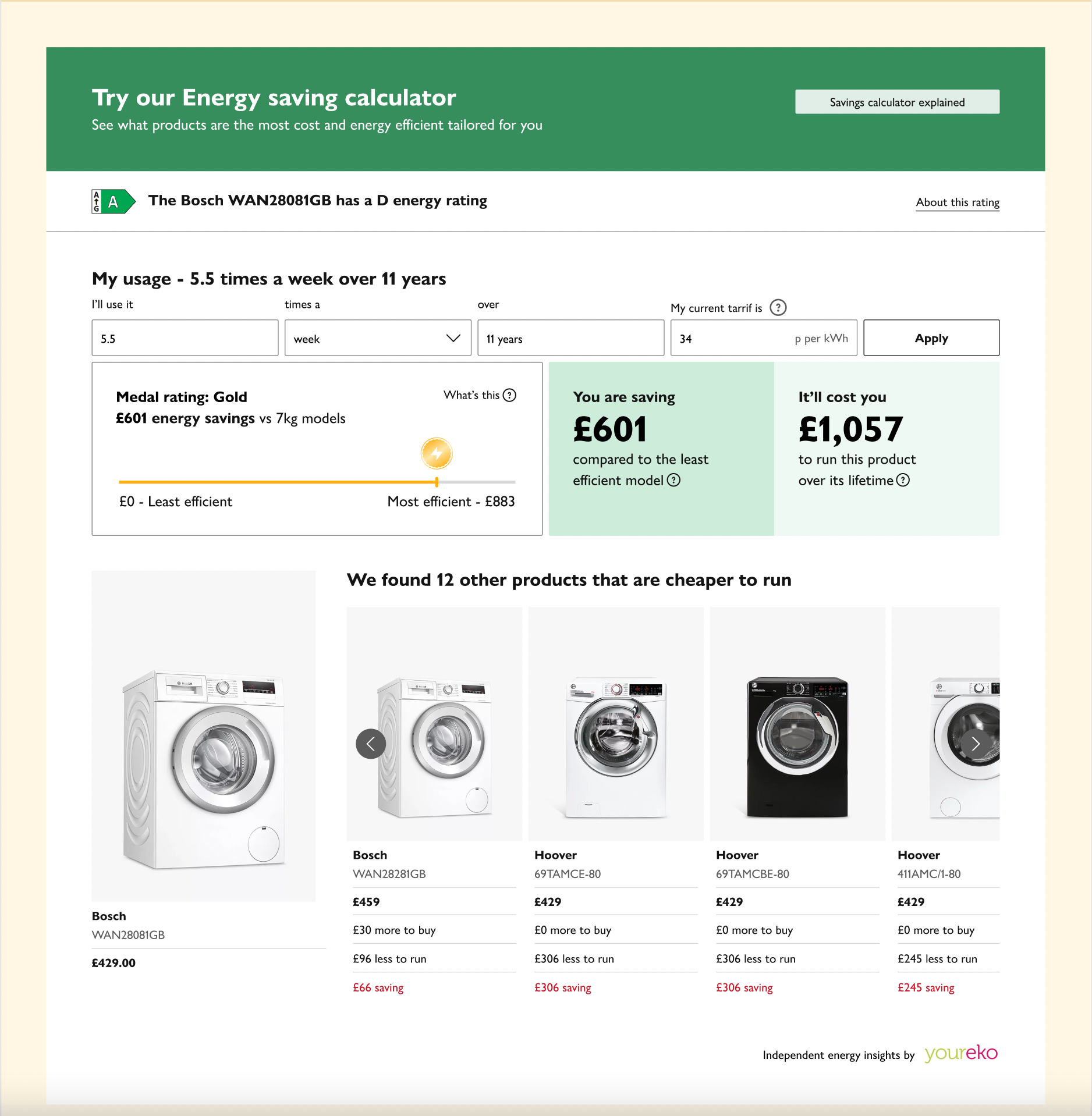
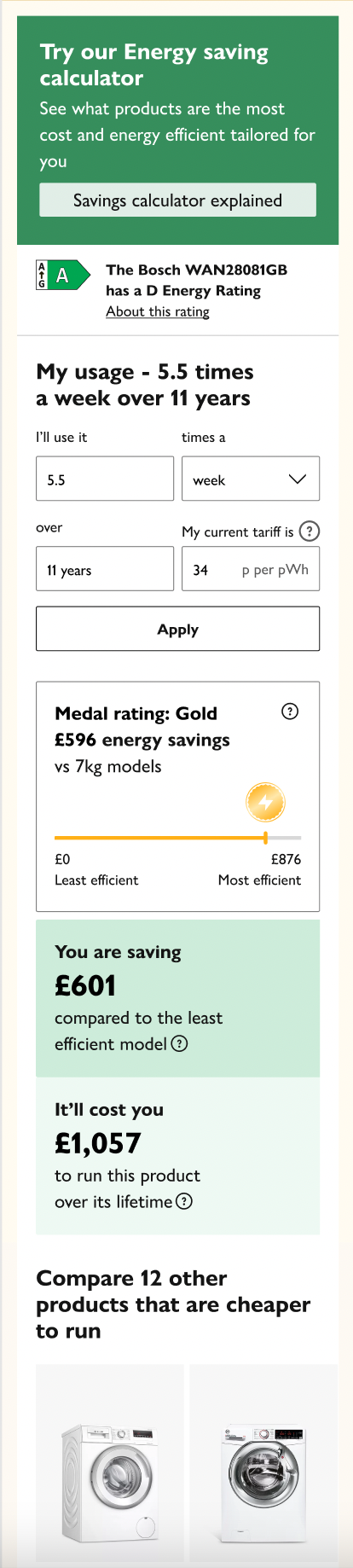
To align the look and feel of the Energy Savings Tool by YourEko to fit into the Joyfully bold design system as well as deep-diving into how the current tool is being utilised and understood by the user. We reviewed the current medal system as well as the better known energy rating fiche to see which was more relatable and helpful to the customer when deciding on what products to buy. We also looked at bringing the tool ‘in-page’ rather than having a clunky pop up that had too much information jammed into hidden info CTA’s as well as confusing messaging that didn’t explain clearly how the savings and costs were being calculated.
01/DISCOVERY
Kick off
Stakeholder meeting
The current YourEko tool doesn’t align with the JLP design system. The UX is clunky and confusing for the user to ascertain how the calculations are being made and introduce the opportunity for customers to review and purchase other recommended products based on their own energy usage.
Why?
Listen
Drive the purchase of more sustainable products
Increase user engagement - click rate, dwell time.
Educate user to how calculations are made
Trust
Encourage returning visits
Increase John Lewis sustainability aspirations.
What?
Present how calculations are made in a simple and digestible way.
align the look and feel of the tool so that it fits into the Joh Lewis Joyfully bold design system.
Understand how the calculations are made and present this information in the most streamline way possible.
Create clear visual distinctions between the cost of running a product and the and savings the cutomer will be making if they were to purchase a specific product.
Improve how the user can see how products are compared with one another
allow the user to customise their usage and provide recommended products.
How?
“I want to be able to see quickly and easily what products are going to save me the most amount of money and help me become a more environmentally conscious customer.”
Review of current tool
Desktop Journey
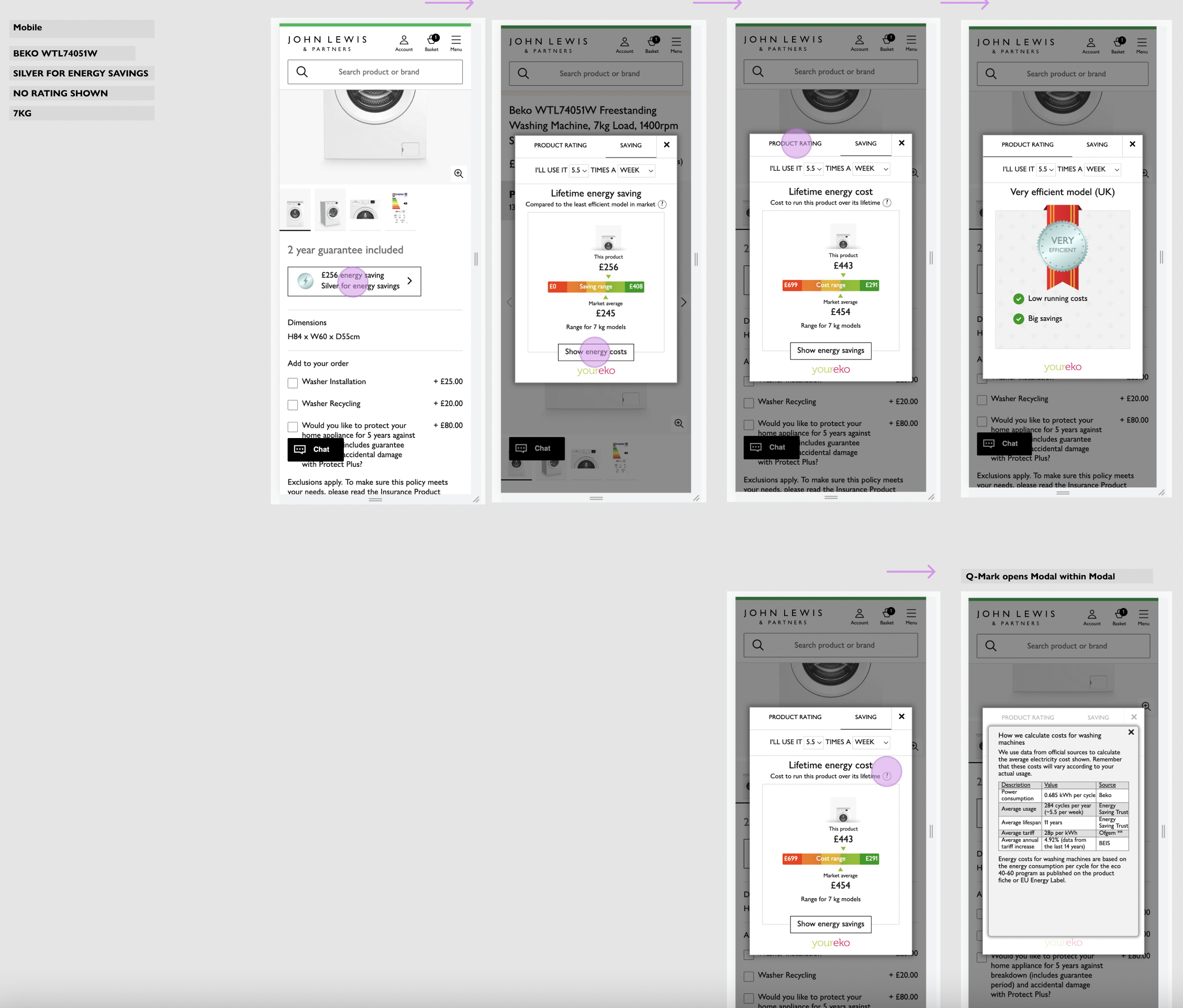
Mobile Journey
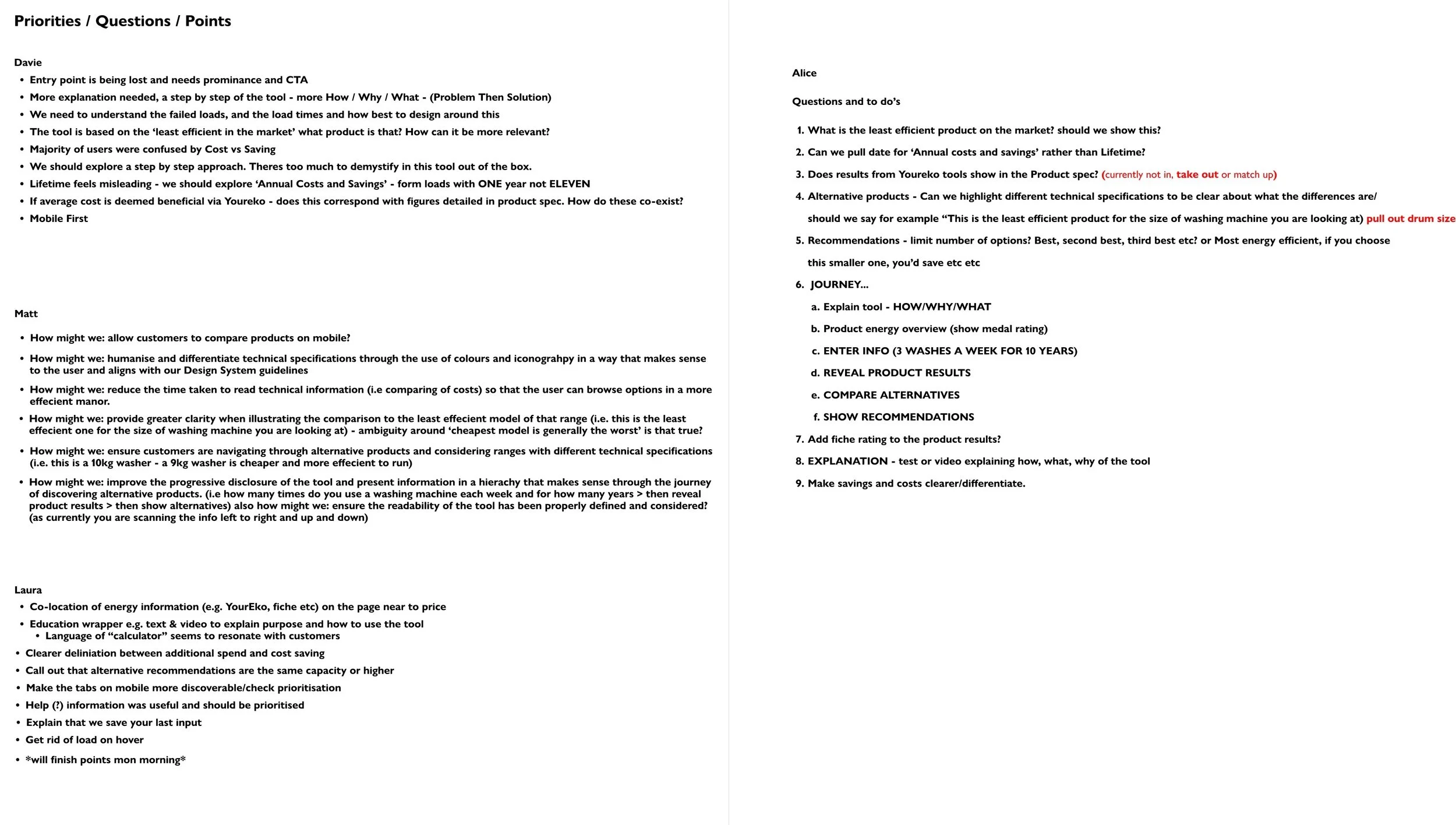
Our first point of call was to do a heuristic evaluation of the current tool by doing an independent walk through ourselves to highlight any obvious issues that were causing usability problems. Once the team had reviewed the current tools and made notes we regrouped to determine what priorities and questions we needed answered when presenting this in user testing.
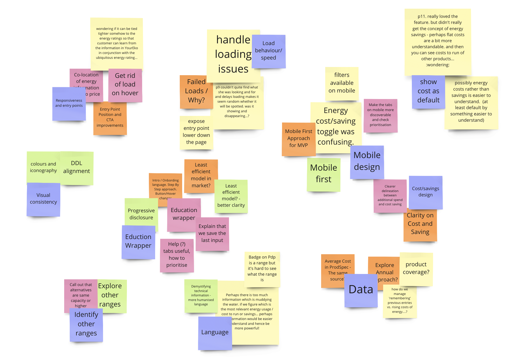
User Experience Research Notes
User Testing: Dovetail
Find Pain-points and propose improvements
MODERATED TESTING
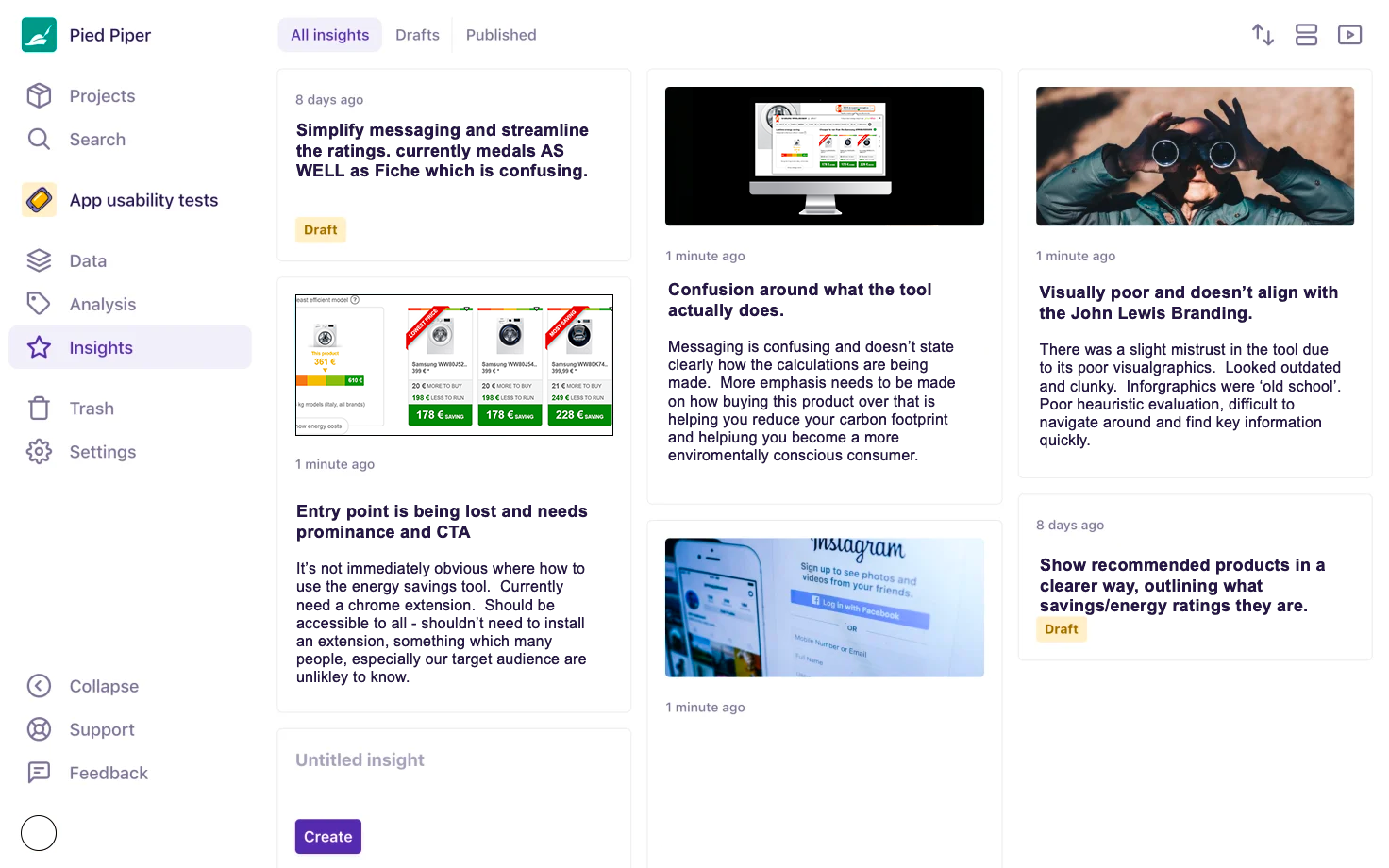
Extensive user testing was undertaken by the user research team. They conducted recorded sessions with two users, walking through the through the current YourEko chrome extension to explore what worked and what pain points they experienced.
RESULTS
01/Impressed by the tool overall and excited by the ability to buy new energy efficient [products to reduce their carbon footprint and become a more sustainability conscious consumer.
02/Confusion over how the calculations were being made.
03/Had to put total trust in the calculations.
04/ Would have liked to see a more comprehensive break down of comparable products
05/Wanted to see a clearer break down of savings
06/Confused by the savings and Costs as the UI showed no differentiations.
07/Messaging about how calculations had been made was confusing and too technical.
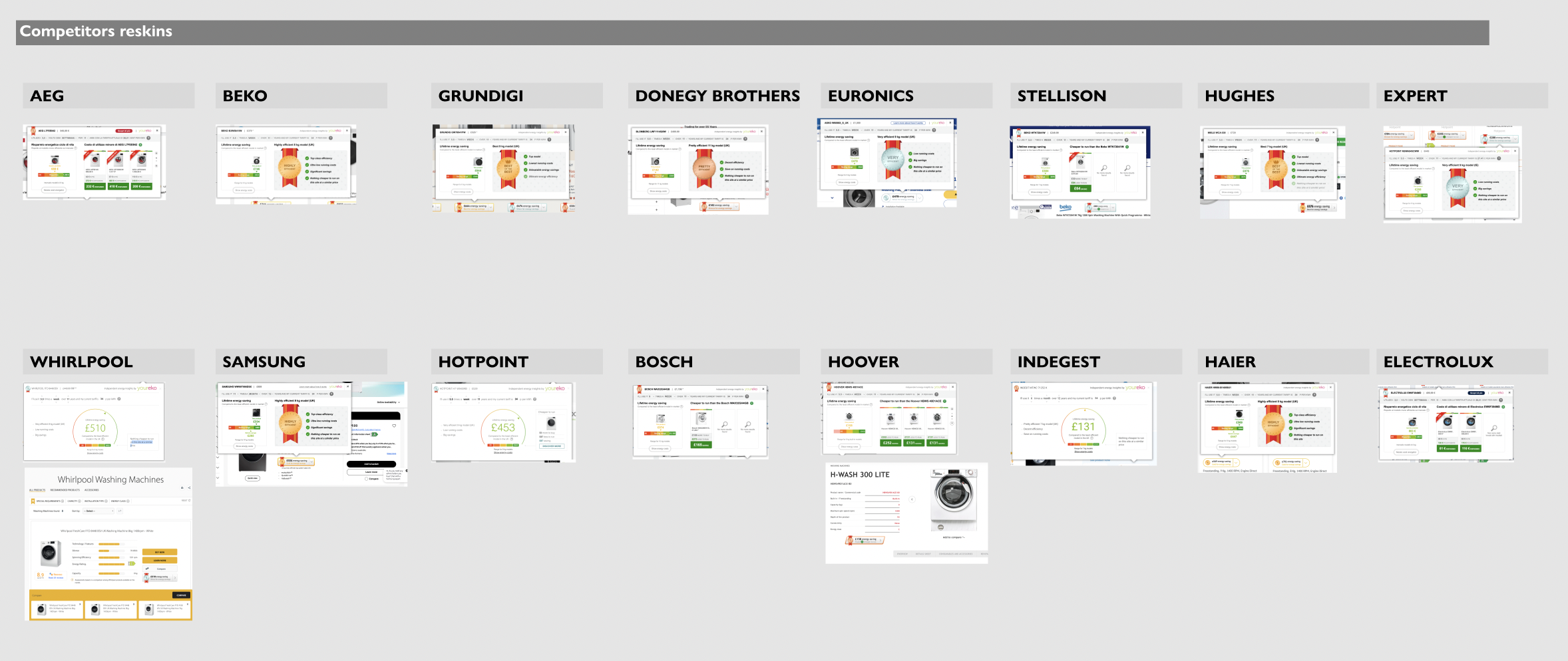
When conducting our competitor analysis it was clear that no-one had done anything but change the font to align with their brands typography. Some had chosen to use different infographic that was ‘out of the box’ from the current tool. There was also no other competitor providing the ability to draw comparisons from all products across the market.
Comparative & Competitor analysis
Key insights
01/Clearer explanation of how calculations are being made
02/Visual design needs to align to John Lewis look and feel
03/high drop out rate when asked for usage
04/user would like this tool to be house within the page rather than having to install an extension
02/DEFINE
User testing
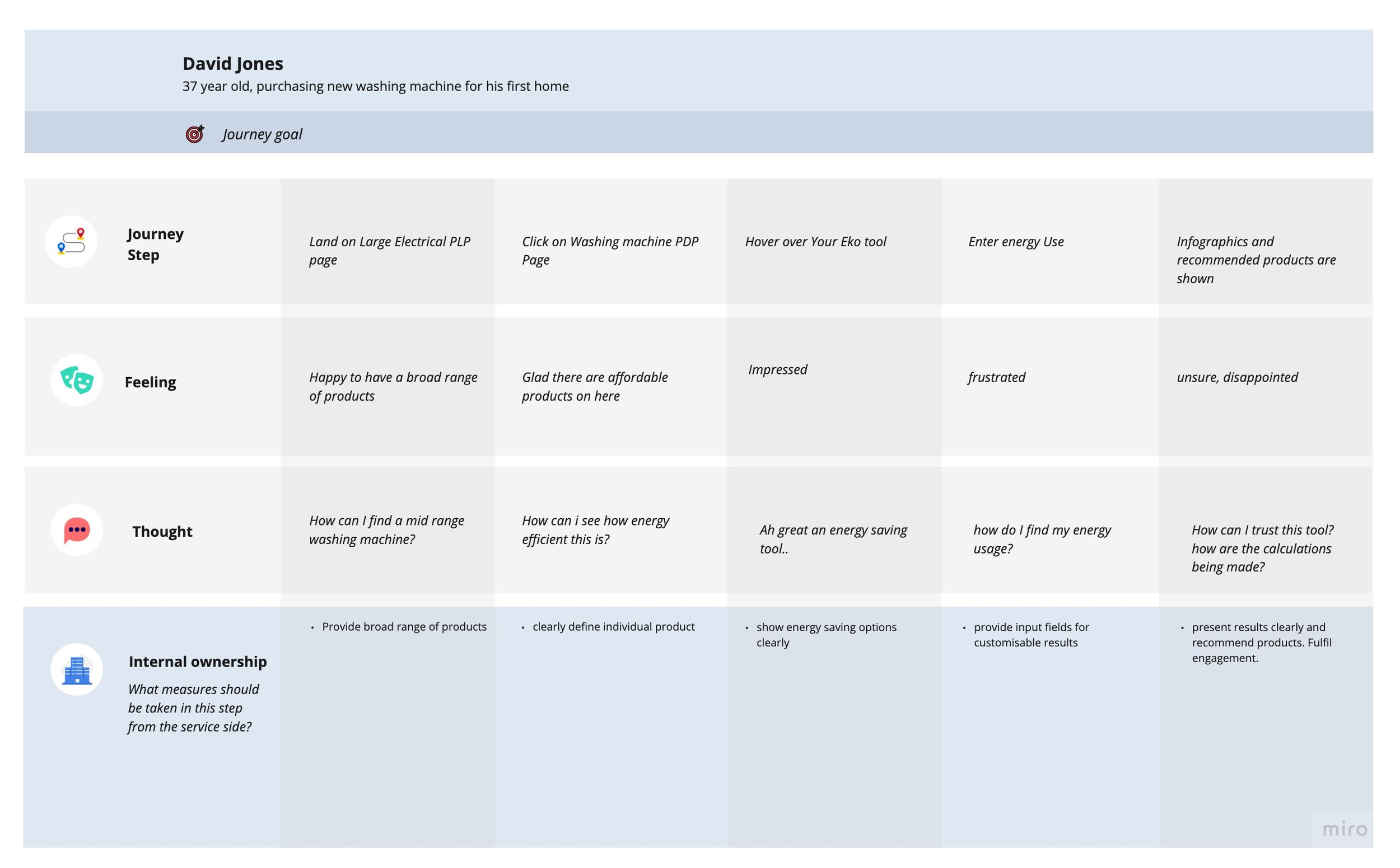
Customer Journey
03/DESIGN
Internal Design system and component library
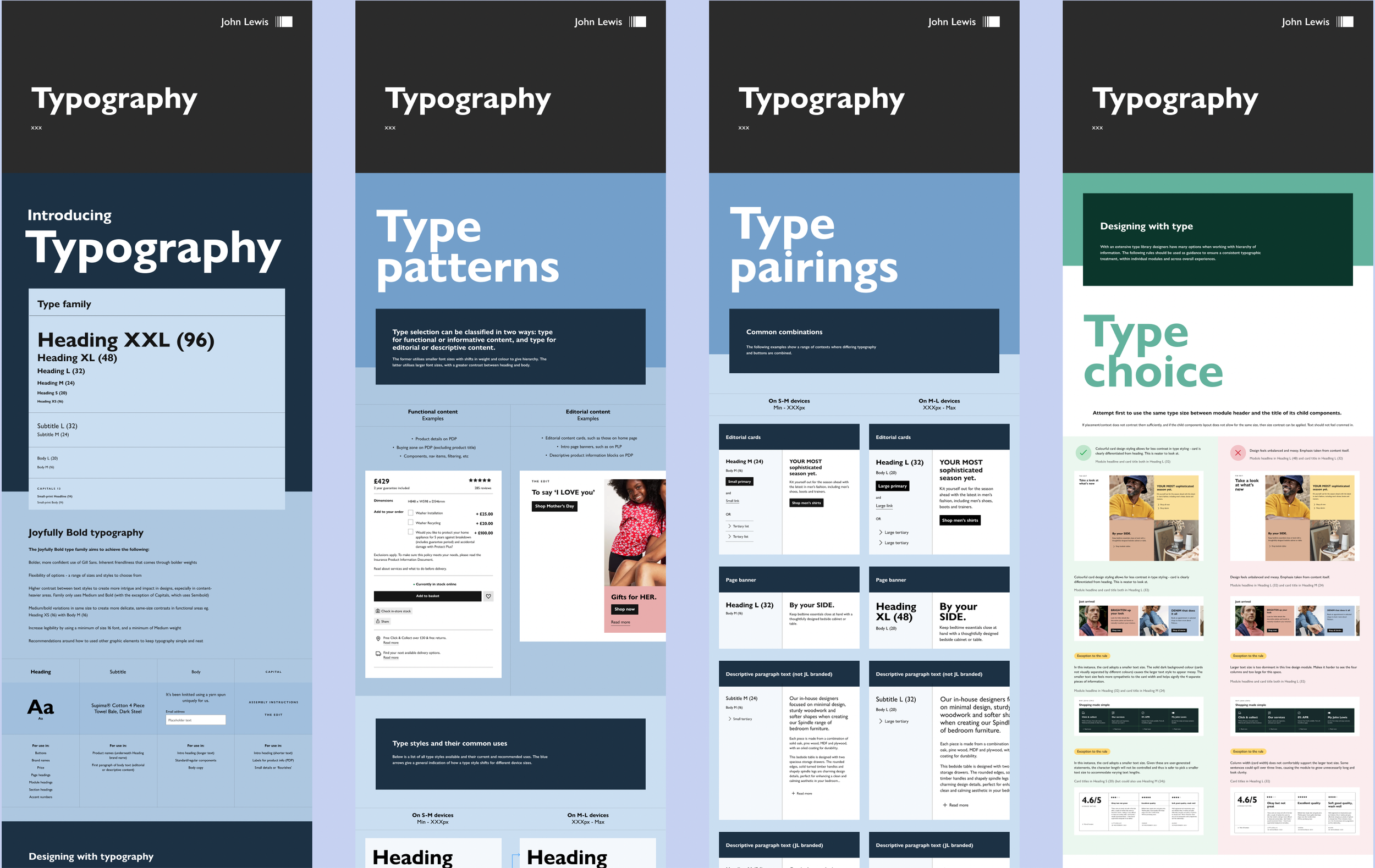
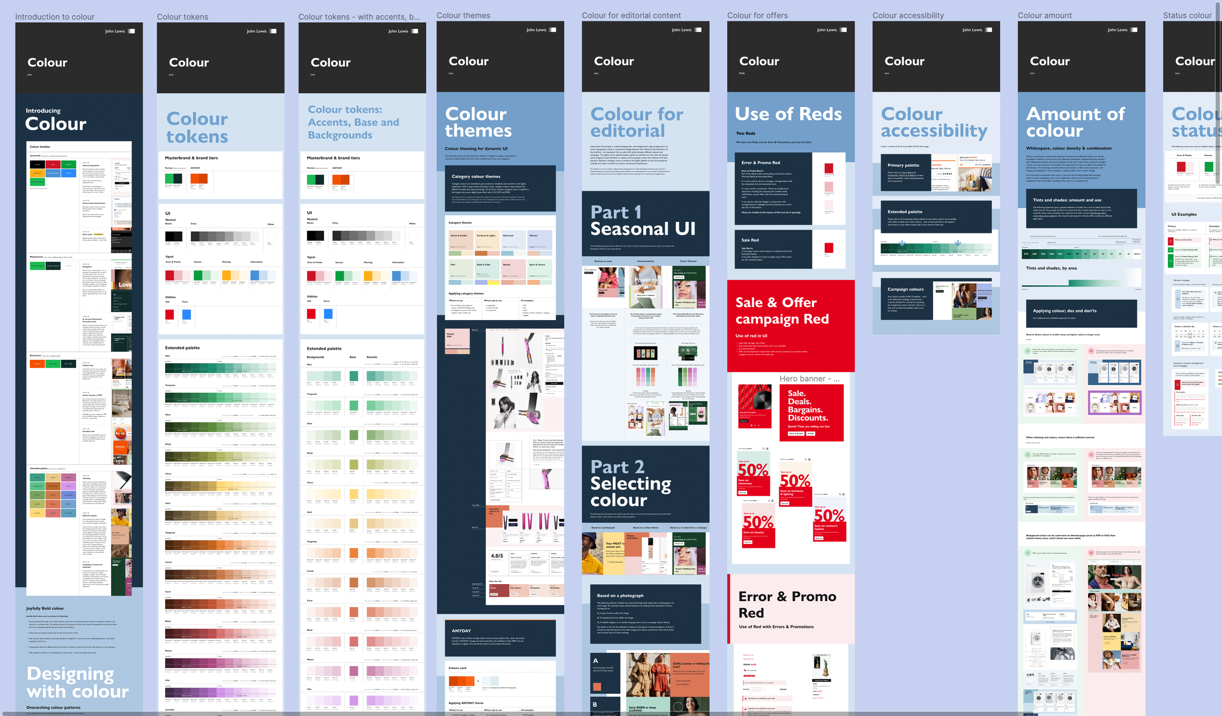
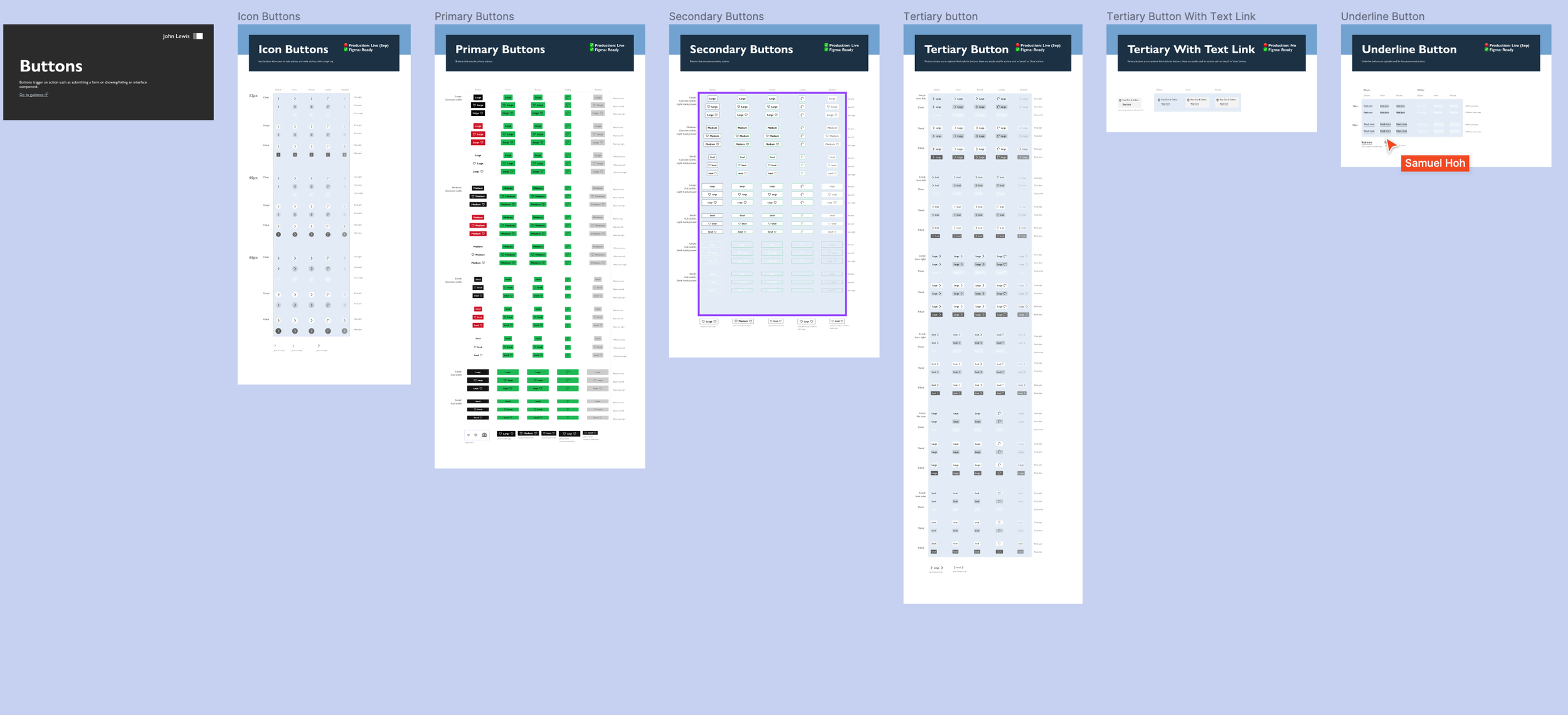
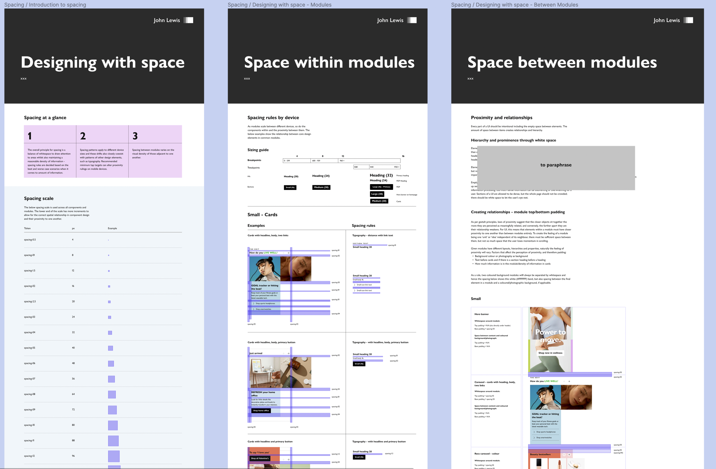
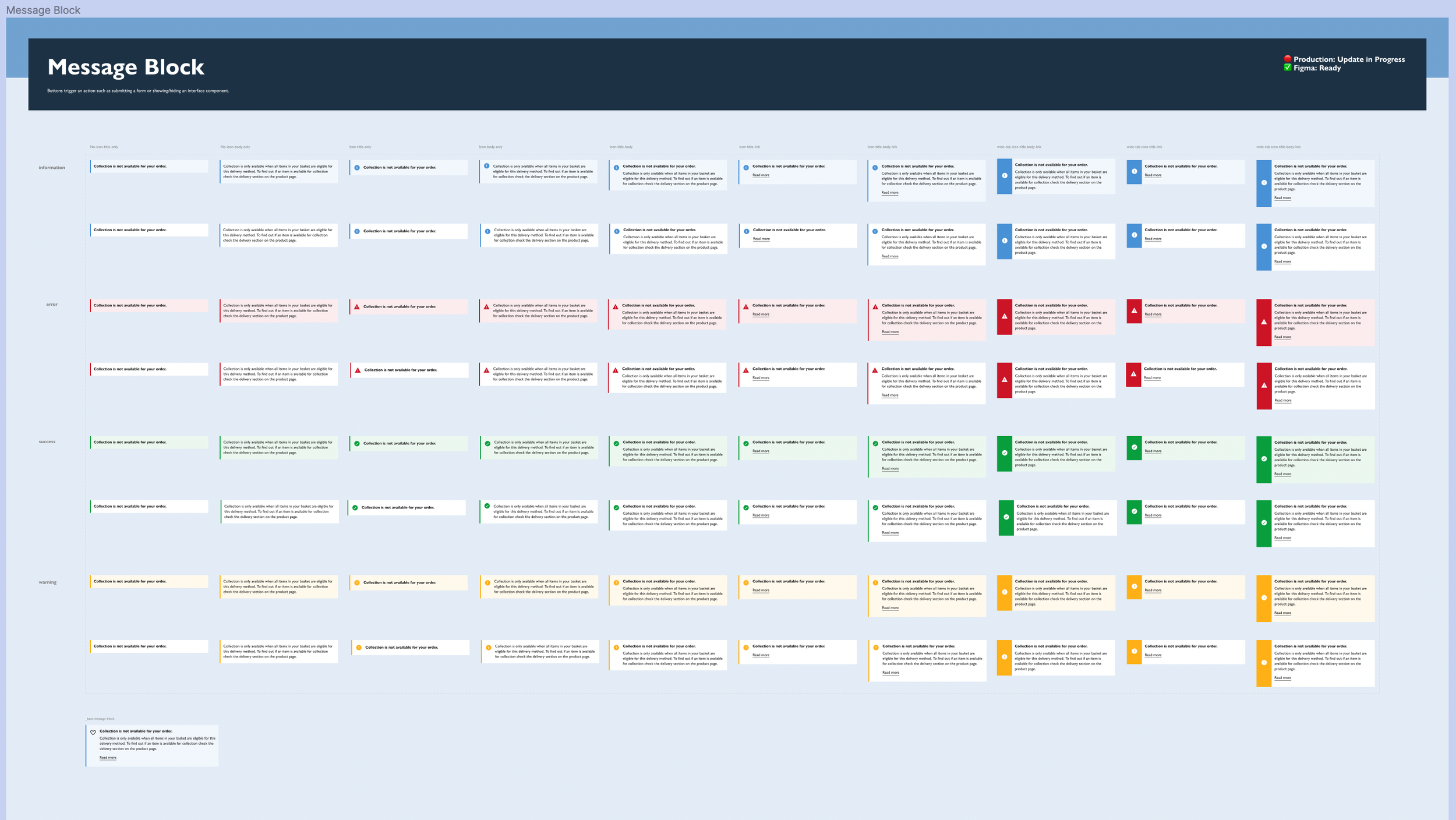
Exploring use of existing components in the Joyfully bold UI Design system.
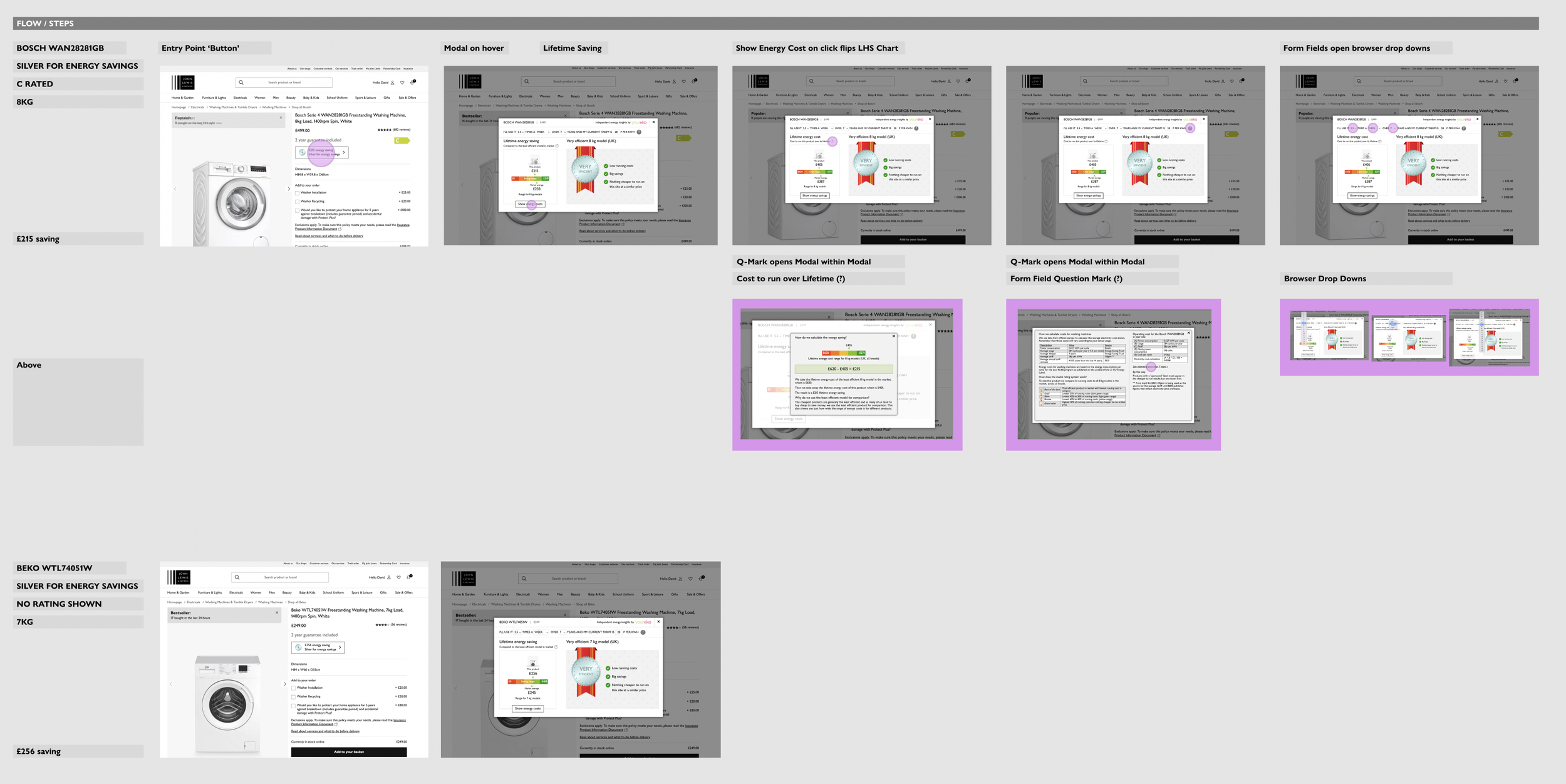
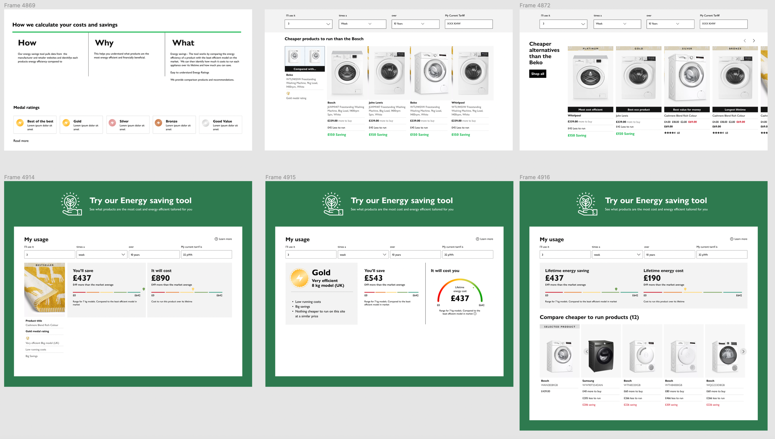
First design iterations for Desktop
After a discussion with the head of UI, we were made aware of a desire to move away from the use of modals, so we happily dropped this option and started exploring far more visually exciting components from within the Joyfully bold design system.
Initial step by step approach for mobile
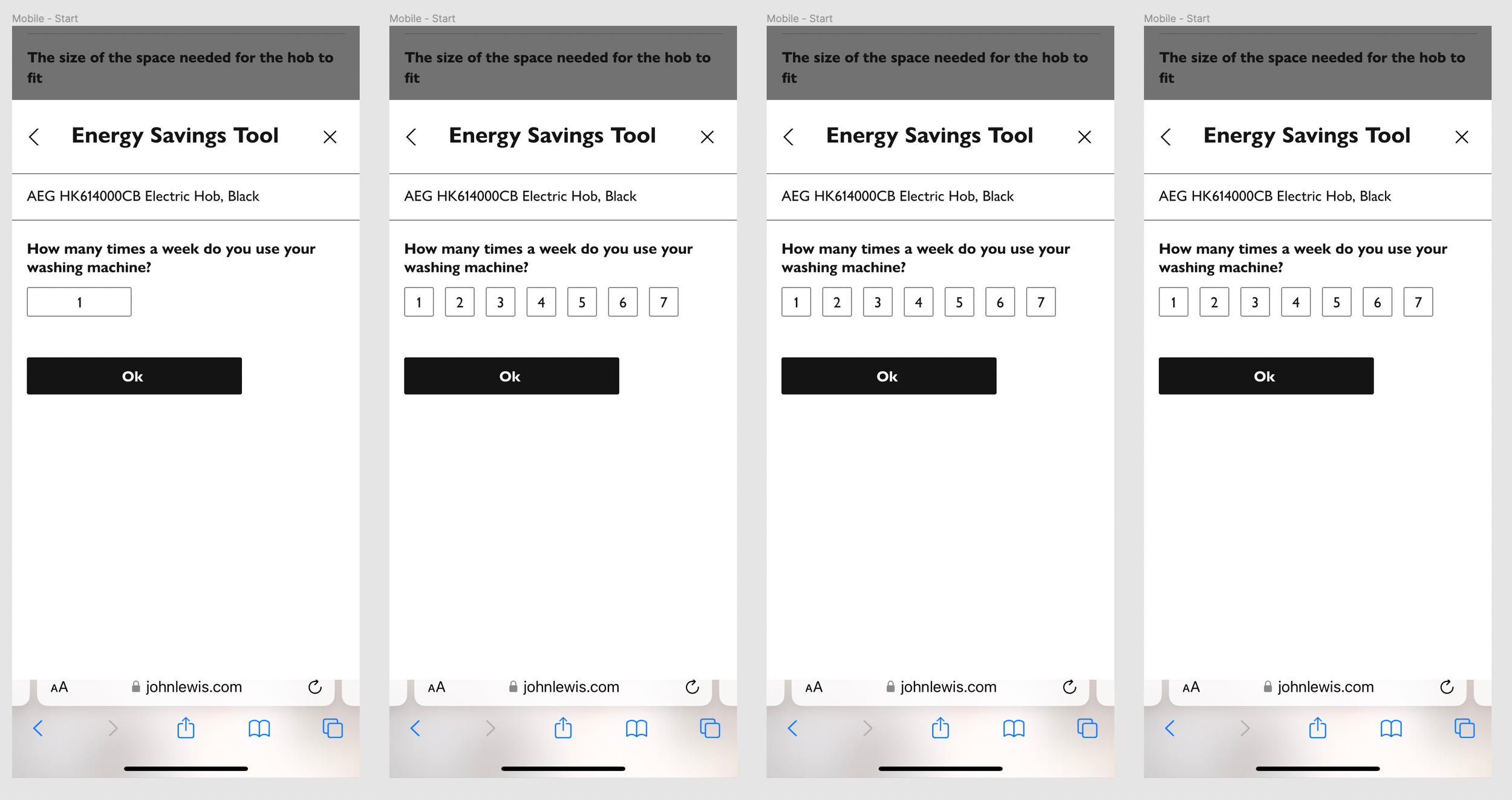
Continues hi-fidelity wireframe exploration
As is often the case, we had to attempt to create this tool with the components that already existed within the design system. However, some elements such as the infographics would have to be created from scratch, developed and added into the design system. Ngaire (Lead UI) worked together to explore what options we had before making adaptions of existing components and developing new ones.
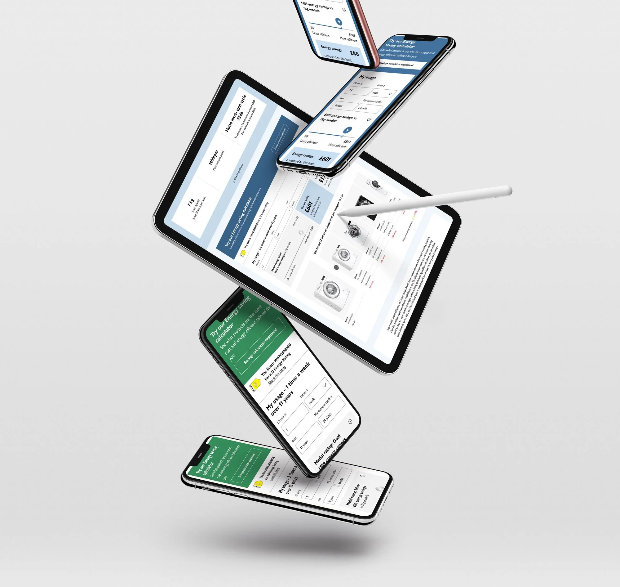
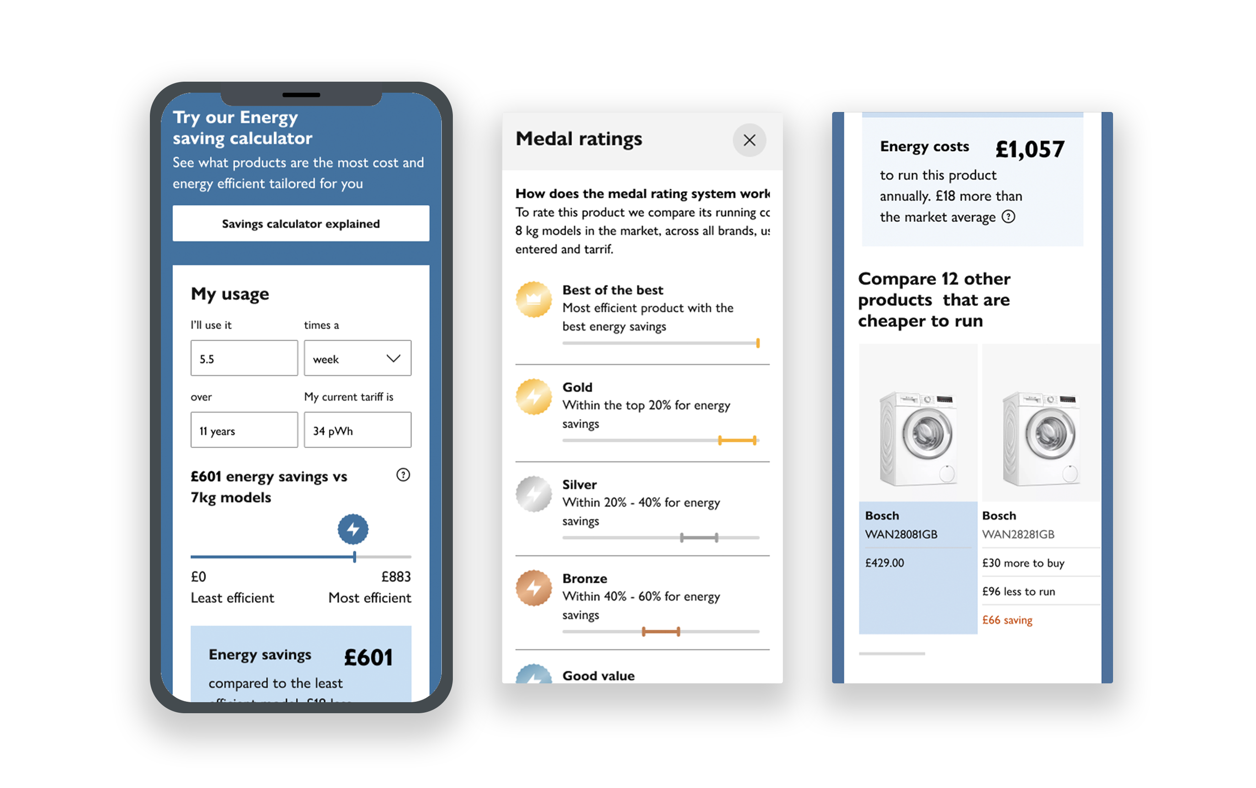
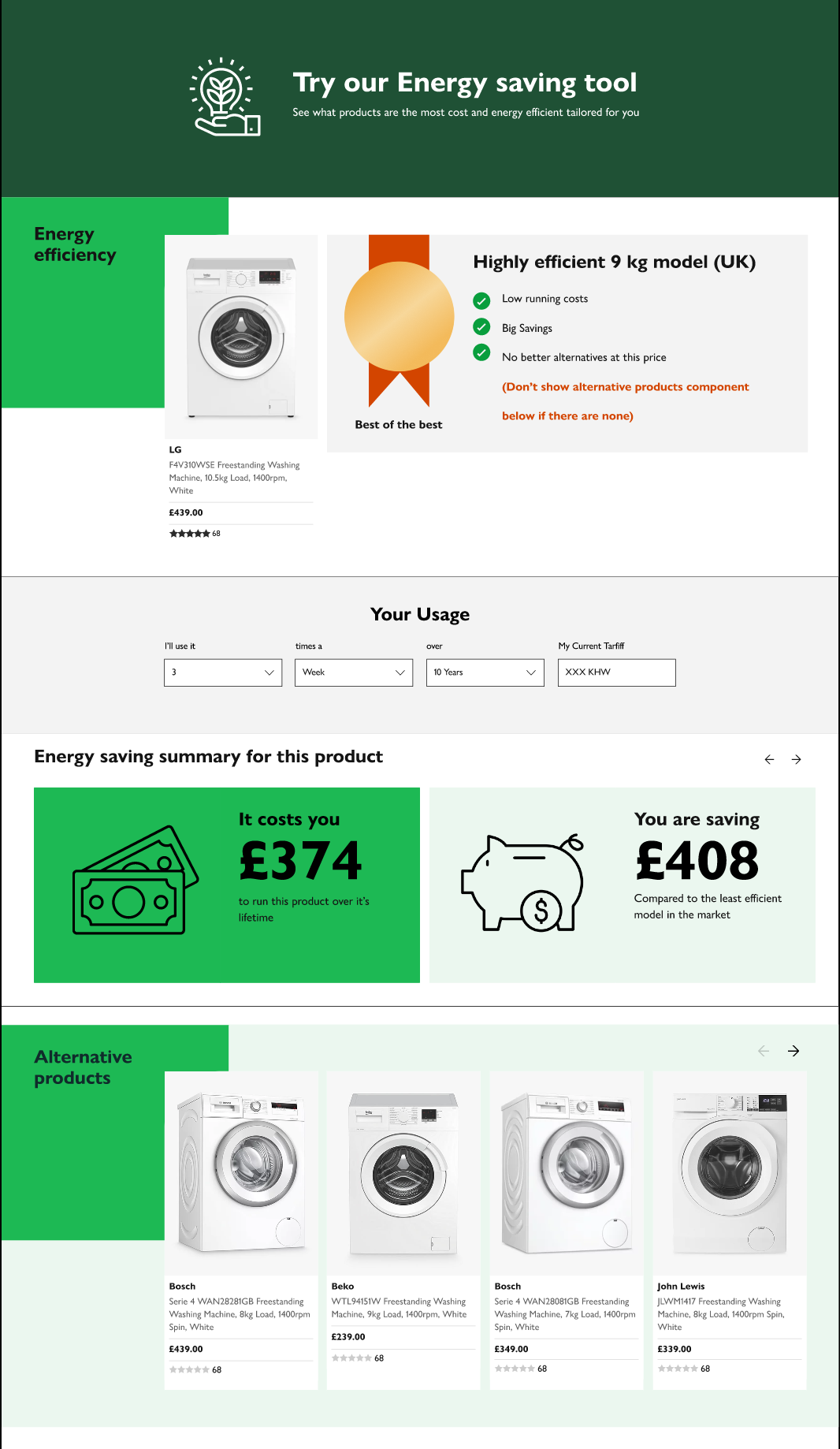
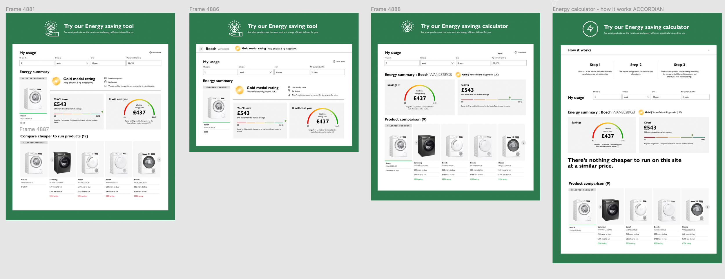
Final High fidelity wireframes
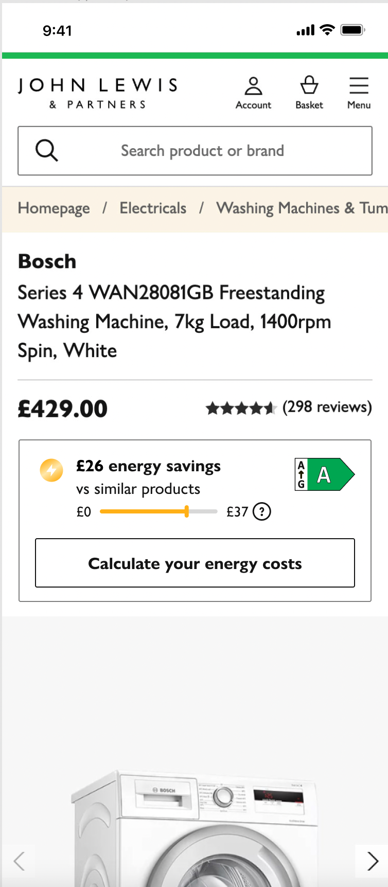
Entry point
After much deliberation and back and forth between the team, the third party team and through user testing we decided to retain both the medals as well as the fiche energy rating.
Final designs
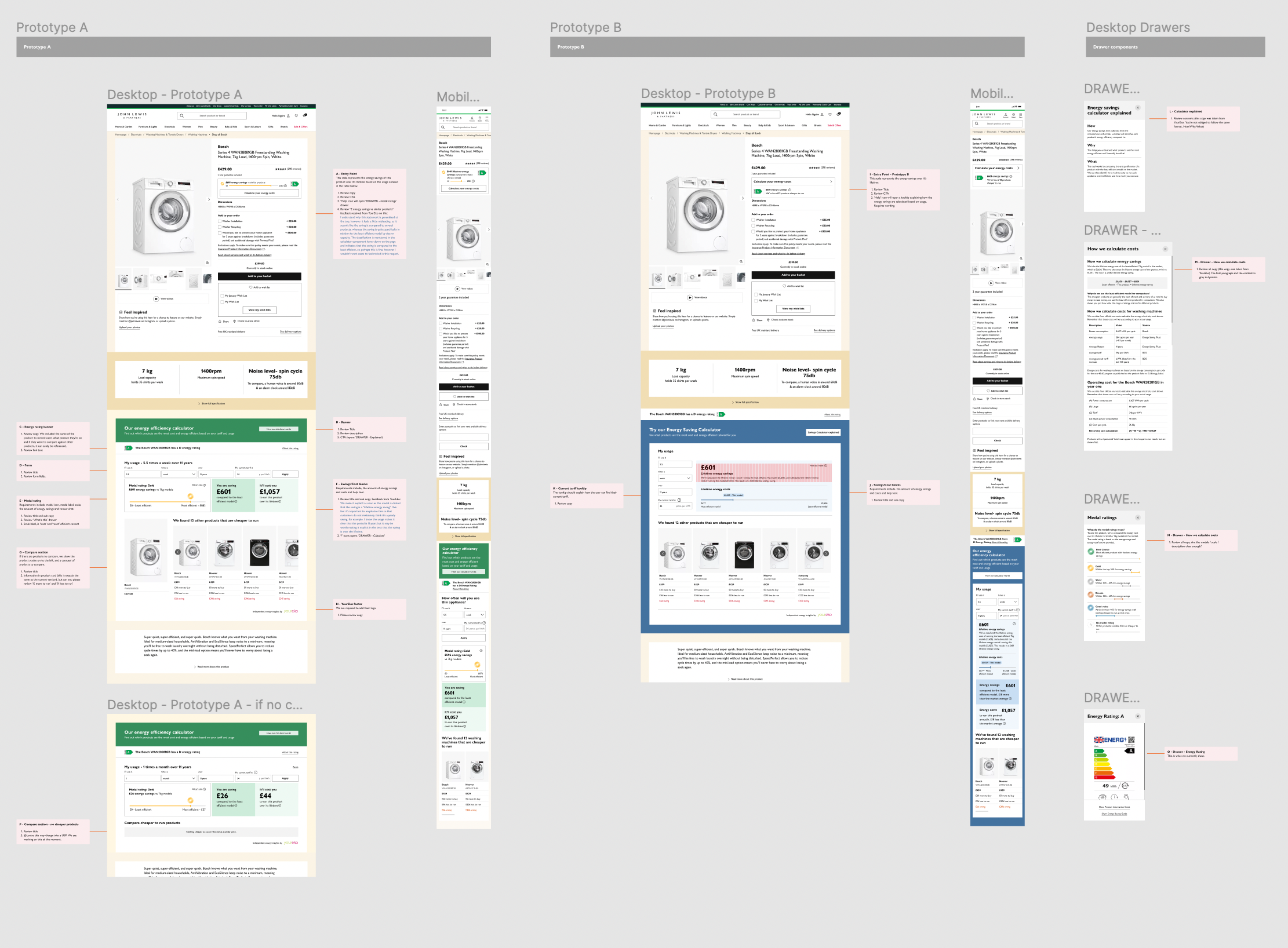
04/PROTOTYPE
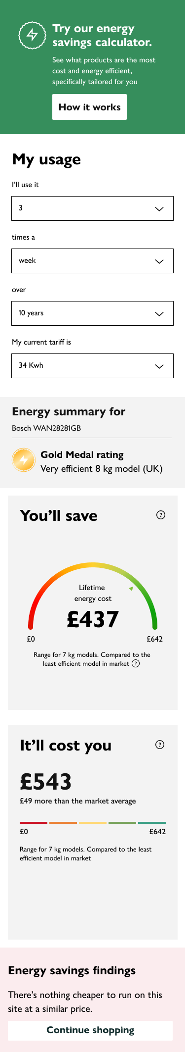
Desktop experience
Mobile experience
05/NEXT STEPS
Before we started feeding the tool into development, we worked closely with the UX writing team to ensure that we had grasped the correct tone of voice. We provided clear notes in figma for the ux writers to review.
01/UX Writer adjustments
We intend to implement A/B testing on our two prototypes.
Two different versions of the designs will be presented to users at random, with each version being shown to a separate group of users. We’ll look at the users response to variations of colours, different infographics, as well as differing messaging.
The performance of each version will then be measured by tracking user behavior, such as the number of clicks, time spent on the page, or conversion rates as well as written and recorded feedback on easy it was to understand how energy saving calculations have been made and are presented.
02/ (A/B) Testing
Once we have established which version to put into development, I will work closely with UI to ensure that Figma files are presented clearly with detailed notes to assist the developers build phase.
03/ Handover
04/ Ongoing user engagement and monitor performance
Once the tool has been launched the team will continue to monitor user feedback and make adjustments as needed to ensure the design continues to meet the needs and expectations of our users.