
Client: Sage.com
Role: Senior UX/UI Designer
Duration: 4 Months
Tools: Pen & Paper, Figma, Google analytics, Content square, Miro
Responsibilities: User Interviews / Facilitated Stakeholder meetings / User Journeys / Empathy mapping / Contextual interviews / Information Architecture / Site Mapping / Competitive & Comparative analysis / Content auditing / Presentation scriptwriting & design / User Testing / Low & High Fidelity Wire-framing prototyping / Data Analysis / New component builds for design system
Sage is a global company and market leader for integrated accounting, payroll, and payment systems with over 11,000 employees.
The Client
The Challange
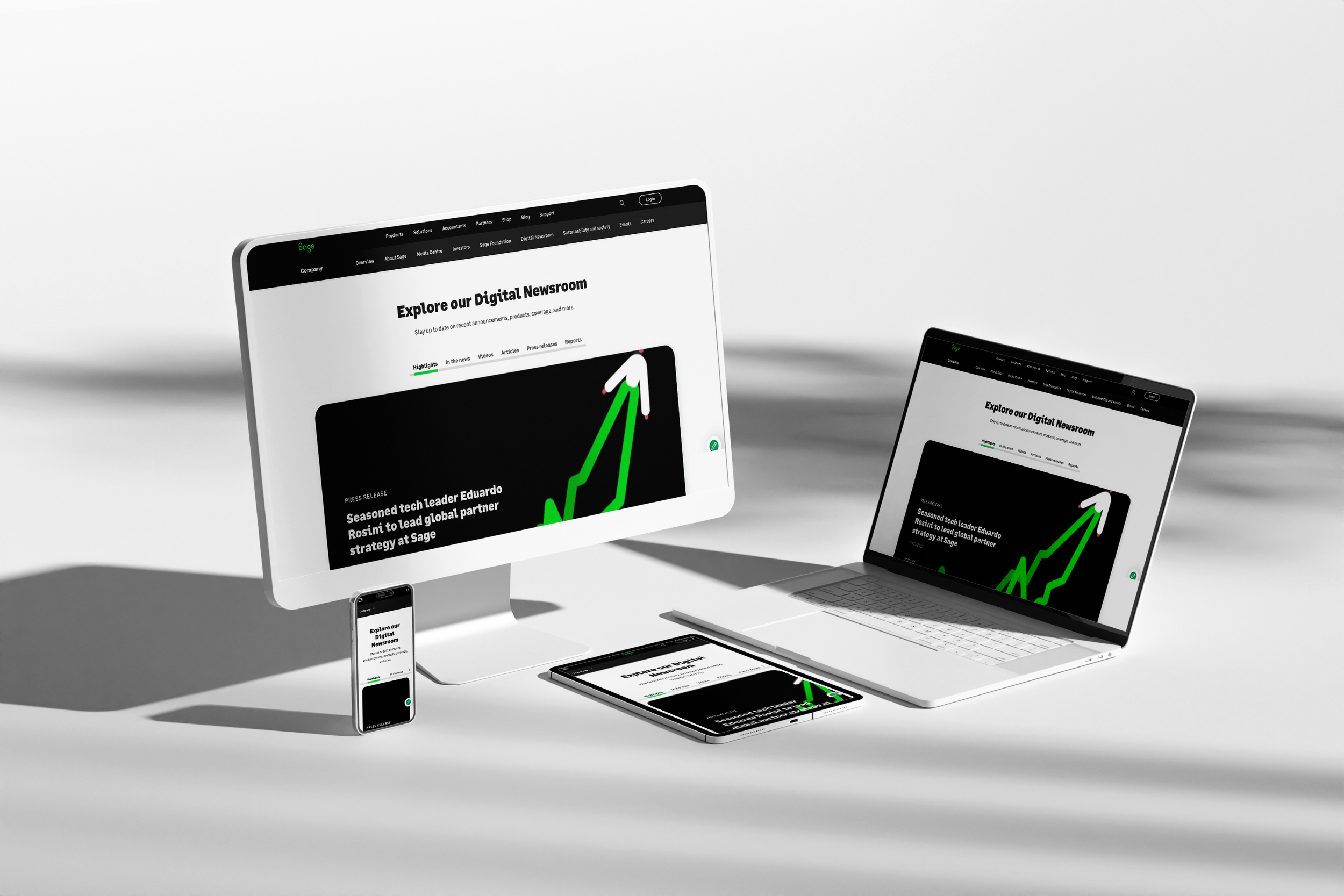
The brief was to design and develop a central Newsroom to house company news, resources and other media content from across Sage.com. The aim was to provide a new space from which the three key audiences (Press, Investors and Influencers) could access content intuitively and easily.
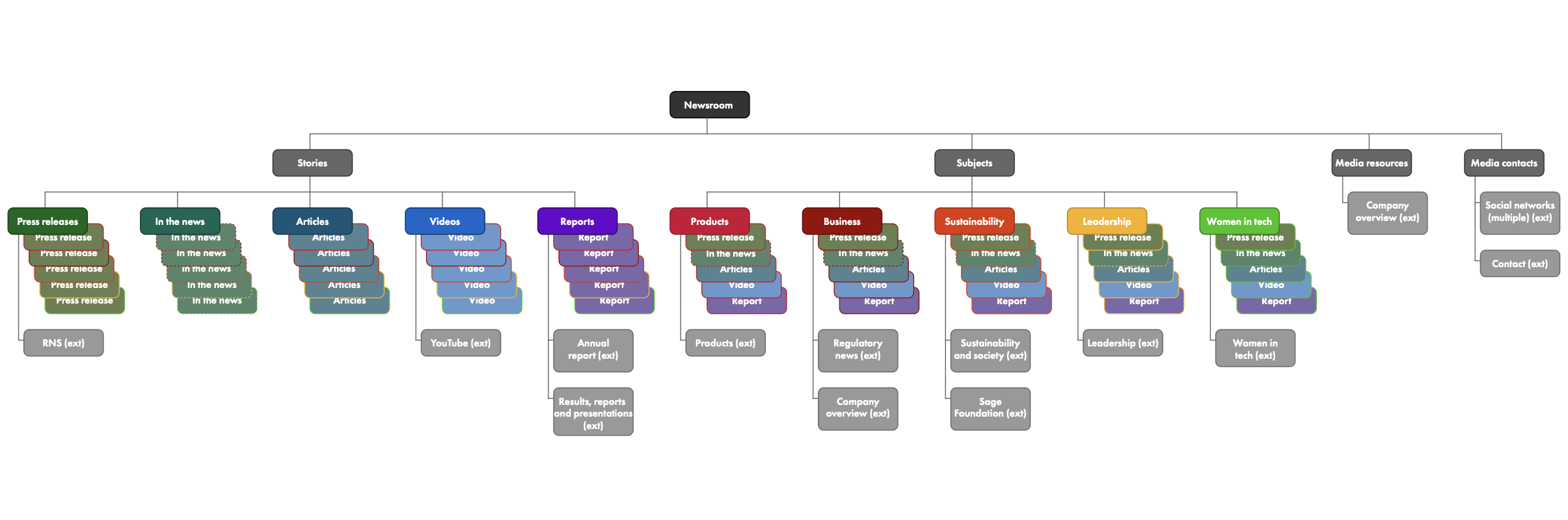
With over 10 years of legacy content on the pre-existing site it was our task to understand what content was engaging our three key audiences (Press/Media, Investors and Influencers) and how this content could be made more accessible than the previous ‘corporate news’ page. We also had to take into consideration how to categorise pre existing content with new content. This meant a thorough look at a Taxomony system and how this could be improved whilst adhering to the current components available to us in the design system.
Practicalities
Easy to use CMS for publishing & scheduling content | Short deadline | The newsroom will sit as a stand alone site | For now, this is focused on UK & US | Needs to integrate/link with Sage.com | The platform needs to be scalable | Need to attract & engage with visual elements | The platform needs to be dynamic | Need to think about duplicated articles
The Solution
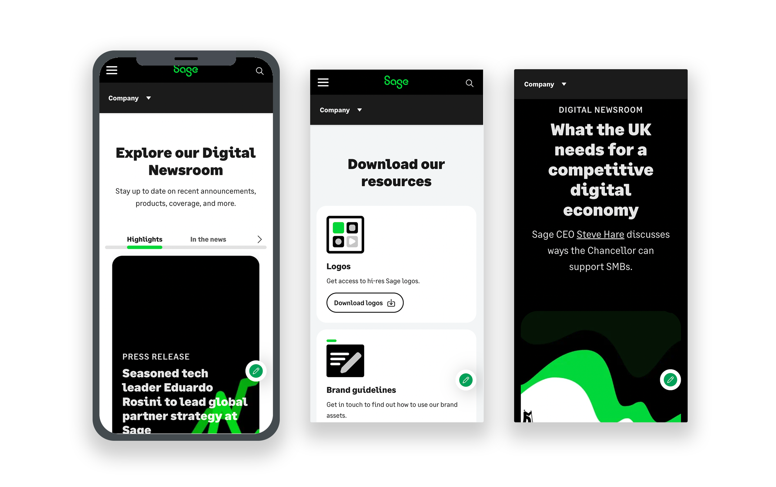
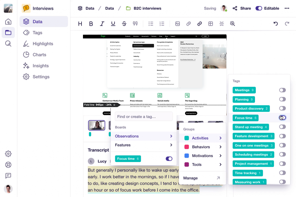
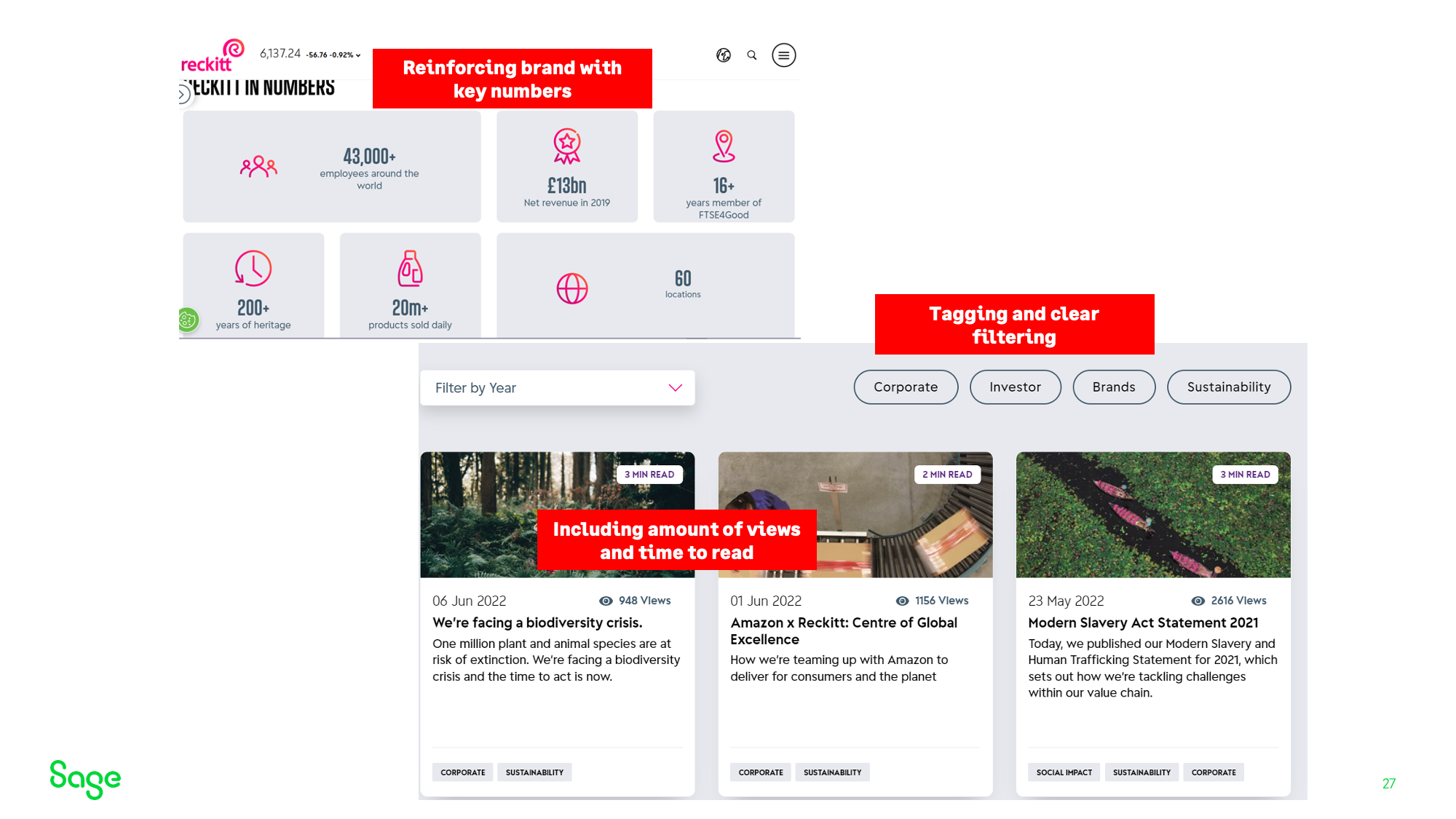
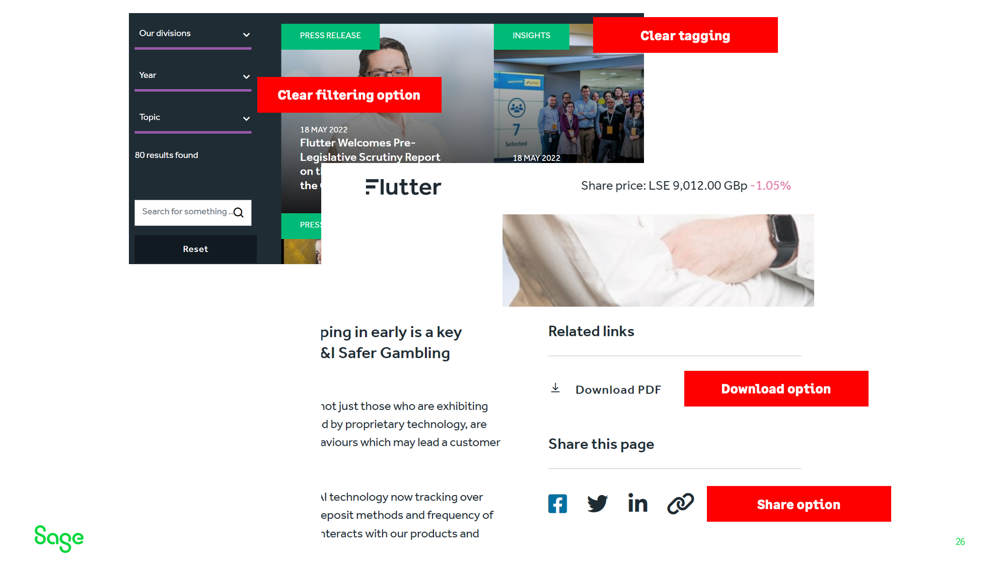
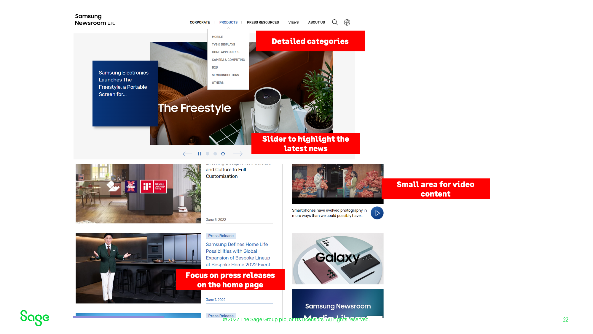
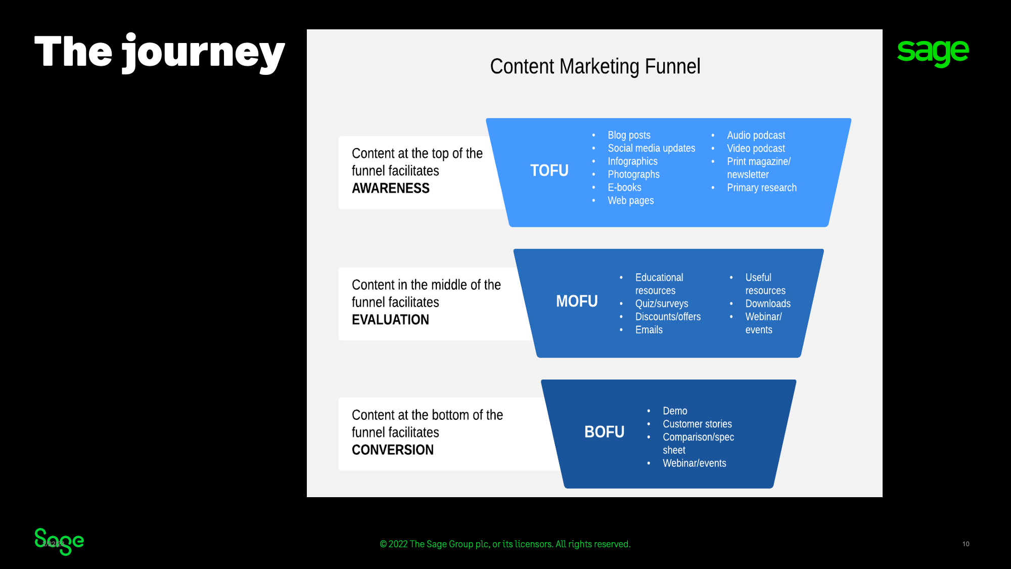
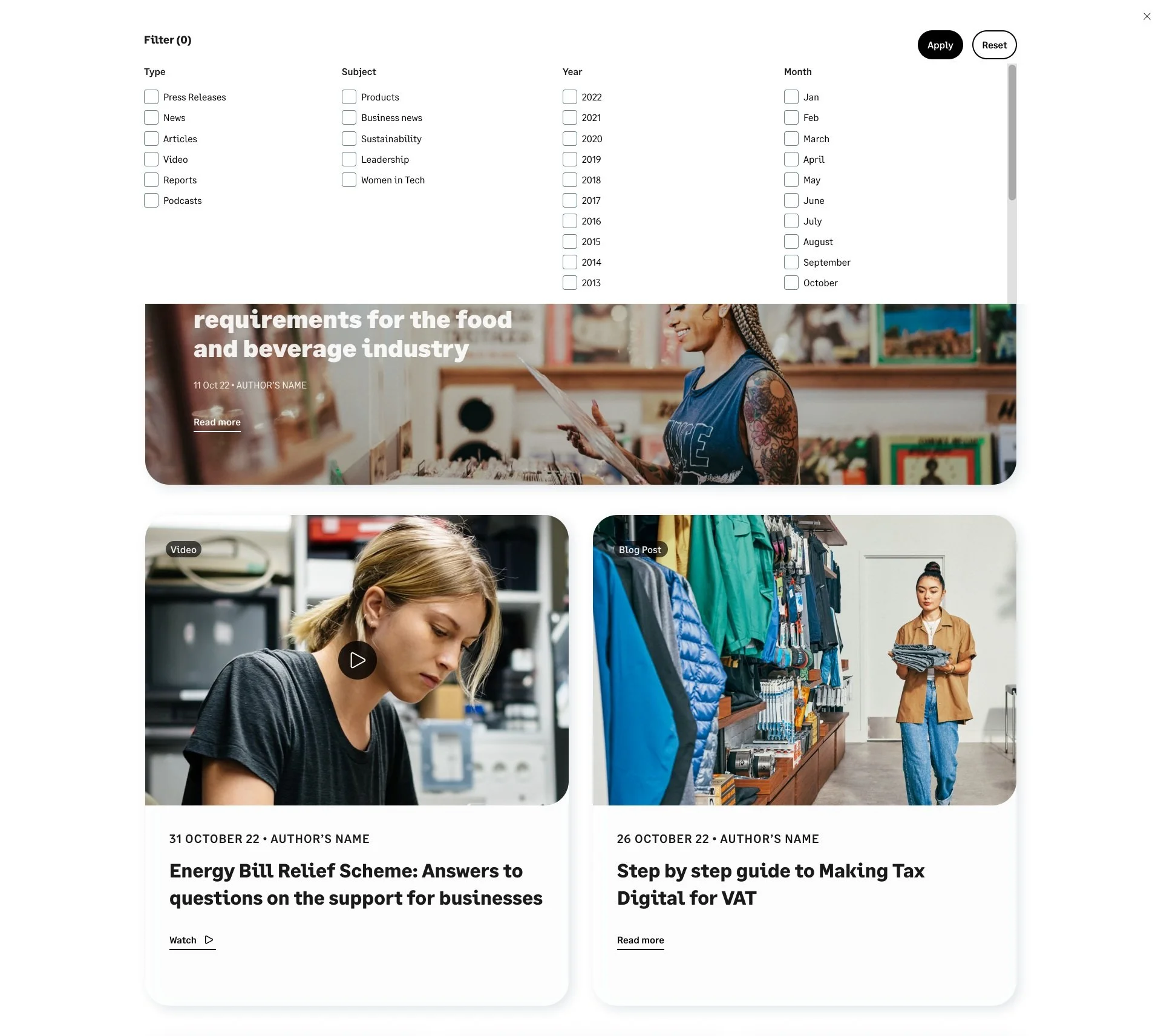
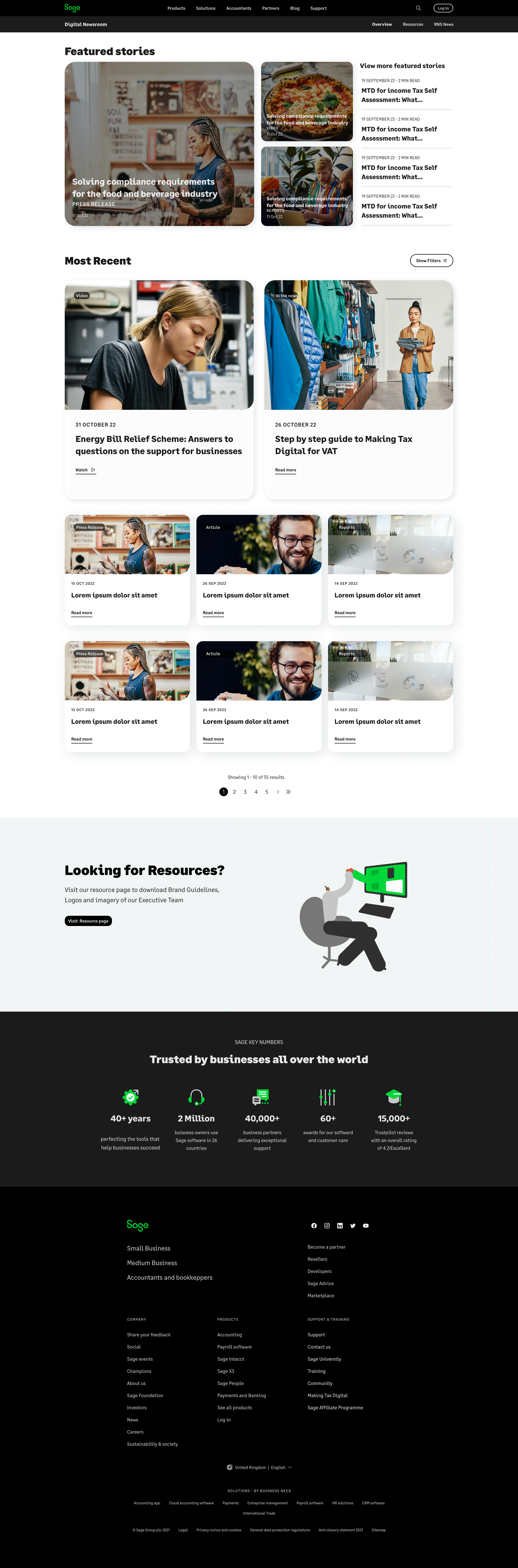
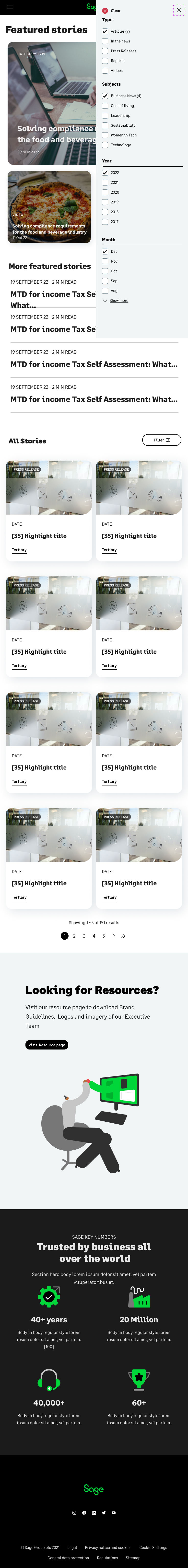
We improved usability and increased user engagement by introducing a comprehensive and dynamic filtering system to the Newsroom. We were able to streamline a vast amount of content via this filtering system and made it easier for the user to navigate their way around the content. New components were create and implemented into the design system including, new card designs, filters and article pages as well as a rethink and redesign on how video and audio content was presented.
We introduced related articles to individual articles pages and provided access to company resources and statistics which showed off Sage’s company successes. We optimised the page speed and performance by grouping content logically, labelling sections clearly and by using a content delivery network to improve load times.
01/DISCOVERY
Kick off
Stakeholder meeting
“At the moment, we have nowhere to talk about Sage, our partners, customers or employees to our Corporate Affairs audiences eg media, analysts and investors in a holistic way. This site will help us to build brand reputation.”
Why?
Listen
Newsroom visits
Increase user engagement - click rate, dwell time.
Trust
Returning visits
Engagement with Sage through contacting Sage, interacting on the newsroom or visiting a product page
Increased ranking on Reptrak
Verbatim feedback from press
Promote
Articles shared on social media
Positive mentions on social media
Positive mentions in external news article
What?
Create a dynamic newsroom filtering system
Establish Taxonomy
Show relevant and recent content
Share stories from customers, investors and employees to increase human approach to accountancy
Build trust with real life experiences of being part of the company, using the product and working closely with Sage
Positive user stories
Enable a simple CMS from which content can be uploaded
Ensure historical content can be accessed easily
Provide a simple search feature
Utilise existing components from within the design system to keep within timeframe.
How?

“ More than simply developing a newsroom, we need to create a hub with its own identity to help build brand reputation.”
Audit of existing site
Data Analysis with Content Square
Following on from the kick off meeting, I set about conducting a UX Audit of the current site. I began this process by establishing the core business objectives before diving into the data analytics and conducting a heuristic evaluation.
We determined from the kick off meeting that the key Business objective for the newsroom was to “Increase brand recognition and favorability with Corporate Affairs audiences to amplify the great work we're already doing”. On the previous site there was no where to talk about Sage, their partners, their customers or employees to their Corporate Affairs audiences eg media, analysts and investors in a holistic way.
Click rate heat zone map with content square.User Testing: Dovetail
Find Pain-points and propose improvements
MODERATED TESTING
Once we’d analysed the qualitative and quantitate data in Content square and Google analytics and established the business KPI’s we then embarked on a couple of short session recordings with some user testers in Dovetail to see in real time how they were using the site and what pain-points they were experiencing.
RESULTS
01/The sessions revealed a clear lack in engagement and retention.
02/The content they were searching for wasn’t easy to find.
03/ Imagery and messaging was poor and uninspiring.
04/ Entry point - was very difficult to navigate to the news page from entry. Took over 45 seconds.
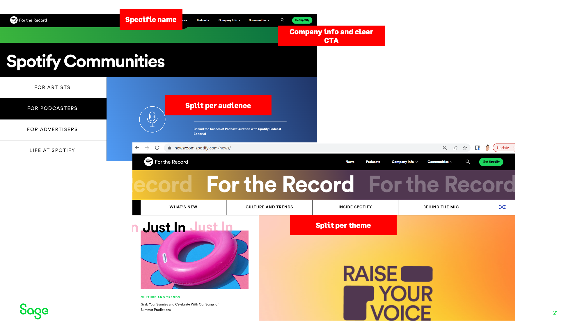
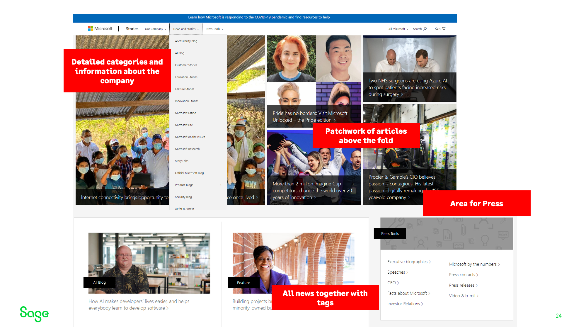
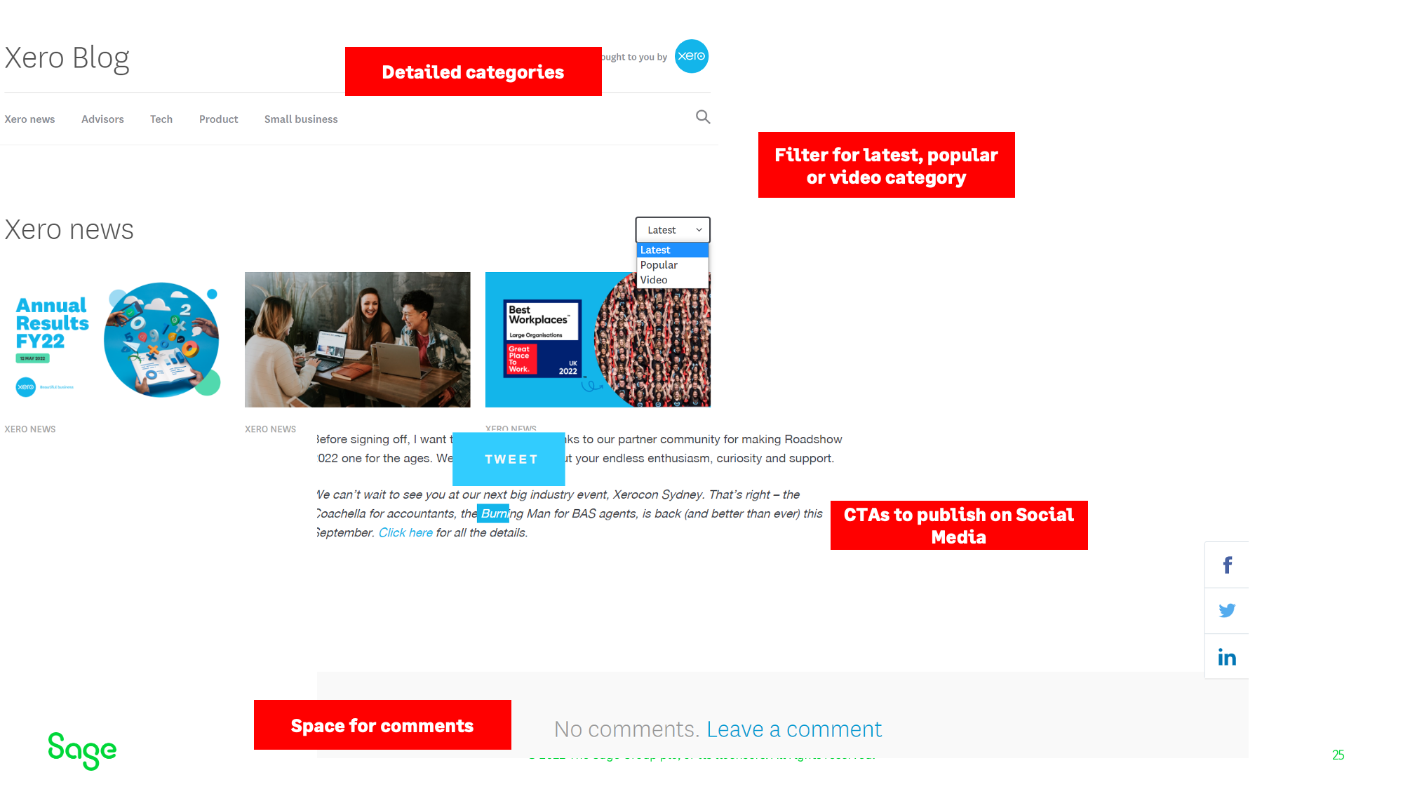
Comparative & Competitor analysis
We looked at a number of other sites that had Newsrooms and reserached how they were presenting dynamic content and how accessible their resources were.
User Interviews
We then conducted User interviews with PR Consultants, Internal employees and Sage customers to understand what pain points they were experiencing and how we could address those issues quickly and efficiently. They both walked through the use of the previous site and outline what content inspired them and gave suggestions as to how the new content space would be useful to them and their clients.

-
PR ConsultantJoanna found the current site difficult to navigate around when looking for simple stats and recent news for her company to build a profile for Sage in her marketing campaign.

-
Sage CustomerI wanted to be able to get a better understanding of where Sage stand on sustainability so I can make a conscious decision about my subscription service with them. I had trouble finding this information easily.
The audience
What do they want?
Press | Media
Need easy access to the latest news, in one place
01/
Need to have enough information about Sage to know and write about them
02/
Need access to a press/media library, including fact sheets, pictures…
03/
Investors
Similar to press, need to have enough information about Sage to know and write about them
01/
Need to know Sage is being mentioned in the press
02/
Could be good to have RNS access as well as corporate website links
03/
Sage is trying to get more investors in the US
04/
Influencers
•Similar to the press, need to have enough information about Sage
01/
They speak to customers and recommend products (we want that to be Sage products)
02/
Data Analysis
Key insights
01/
Most competitor newsrooms had a filter systems
02/
Entry point - usually accessed via a link in the Footer
03/
Low click rate with CTA hidden in the footer
02/DEFINE
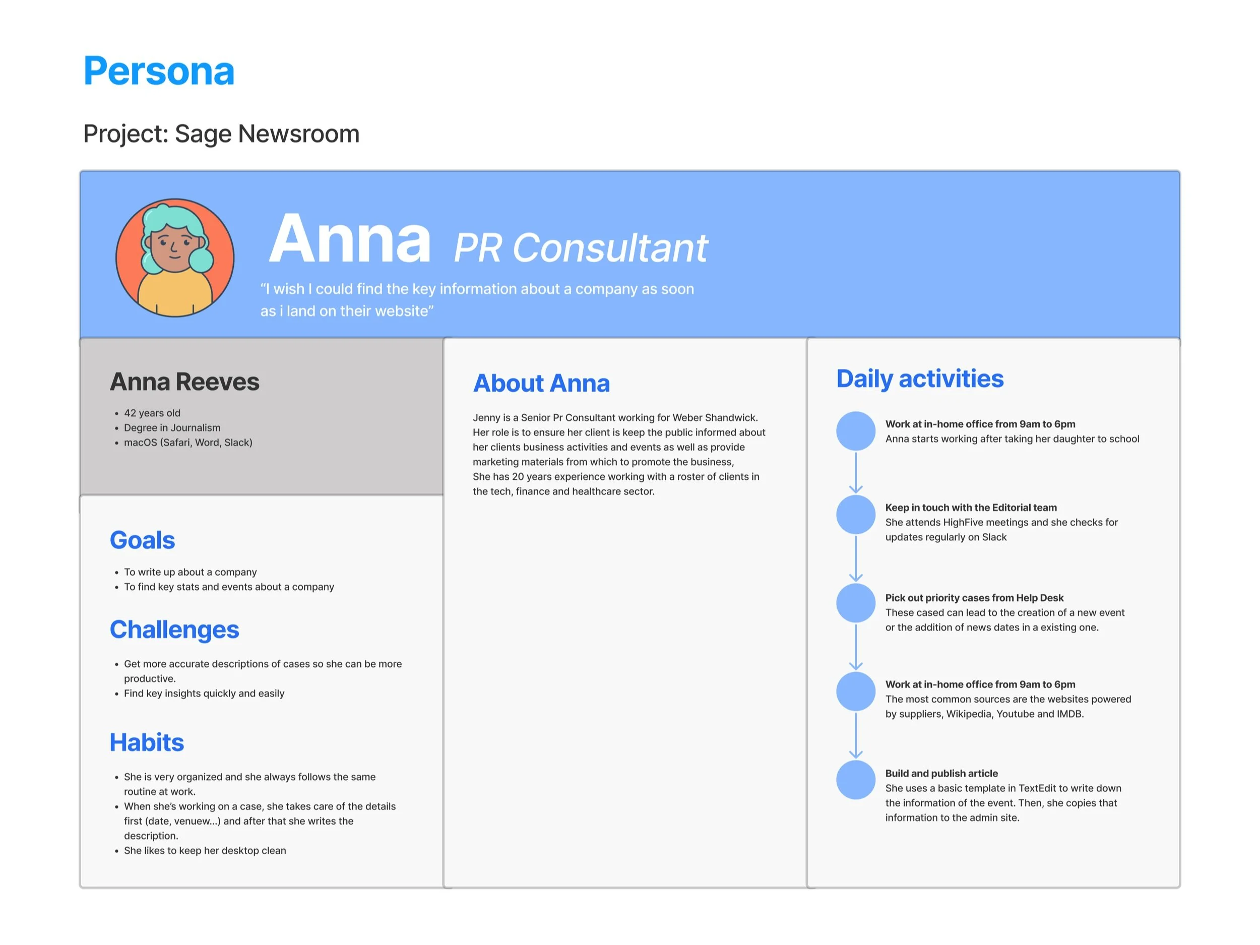
From our user interviews we were able to create some user personas from which we could draw inspiration to ensure we were targeting the news room to right user and maximising engagement to meet our stakeholders KPIs.
Understand personas and user segments
User journey planning
03/DESIGN
Information Architecture
User flows
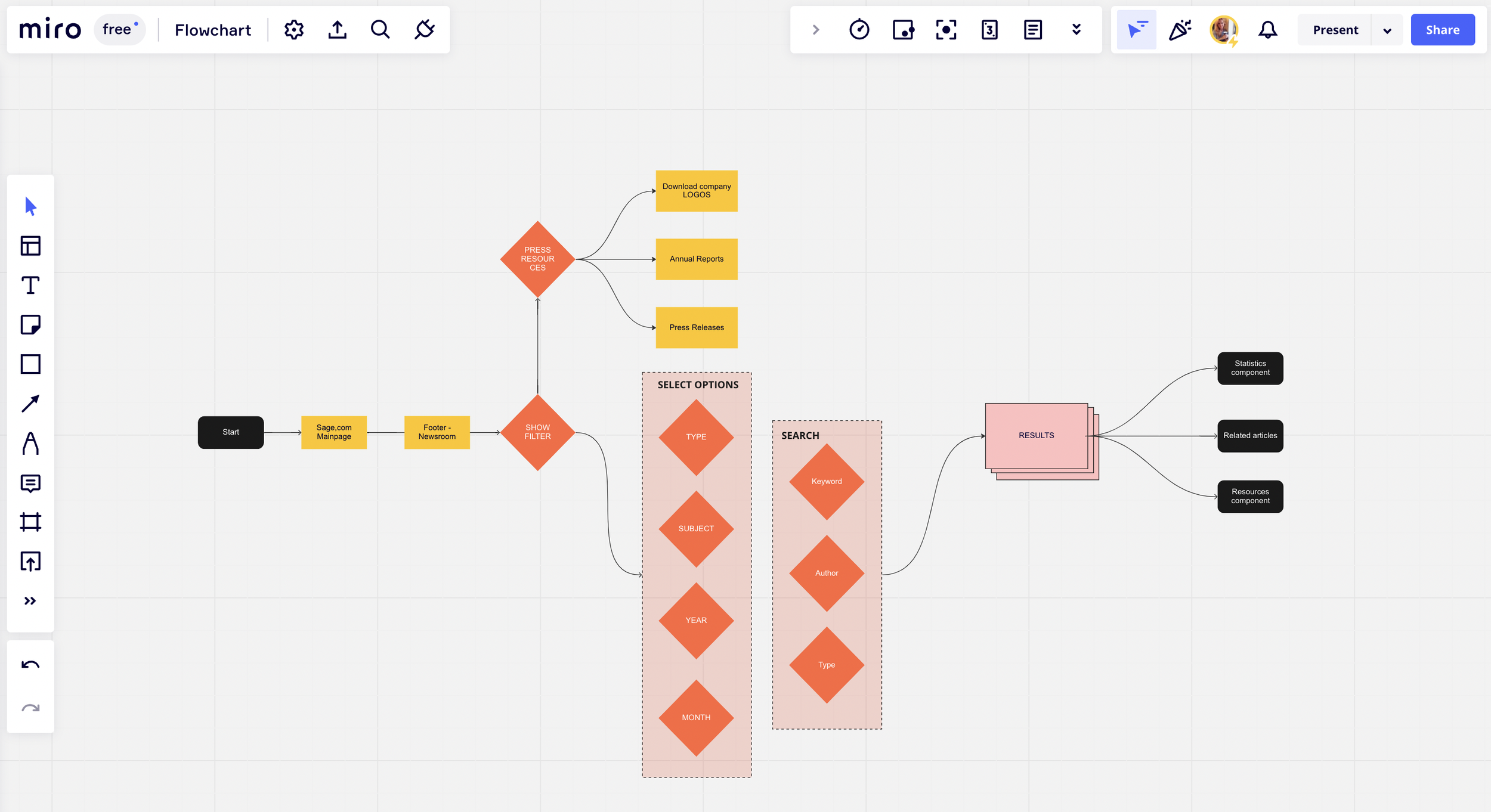

Exploring filtering options

High fidelity wireframes

04/PROTOTYPE
Coming soon…
05/NEXT STEPS
Development
Once the fidelity wireframes and prototypes had been signed off by the stakeholder and product owner, I worked closely with the design system team and development to ensure that our designs were implemented correctly. Due to budgeting and time constraints sadly we had to take a 2 phase approach, meaning that a MVP was launched in January 2023, with a view for the finalised future scope designs to go live in the second half of the year once the new components had been developed.
As with any end to end process, we will continue to monitor the metrics and see how the MVP is performing before pushing forward with phase 2.