Fluocaril offer a wide range of oral and dental hygiene products for all the family. It is a Unilever product.
In line with the Fluocaril Brand’s visual identity, recommend and create a new look & feel for the website.
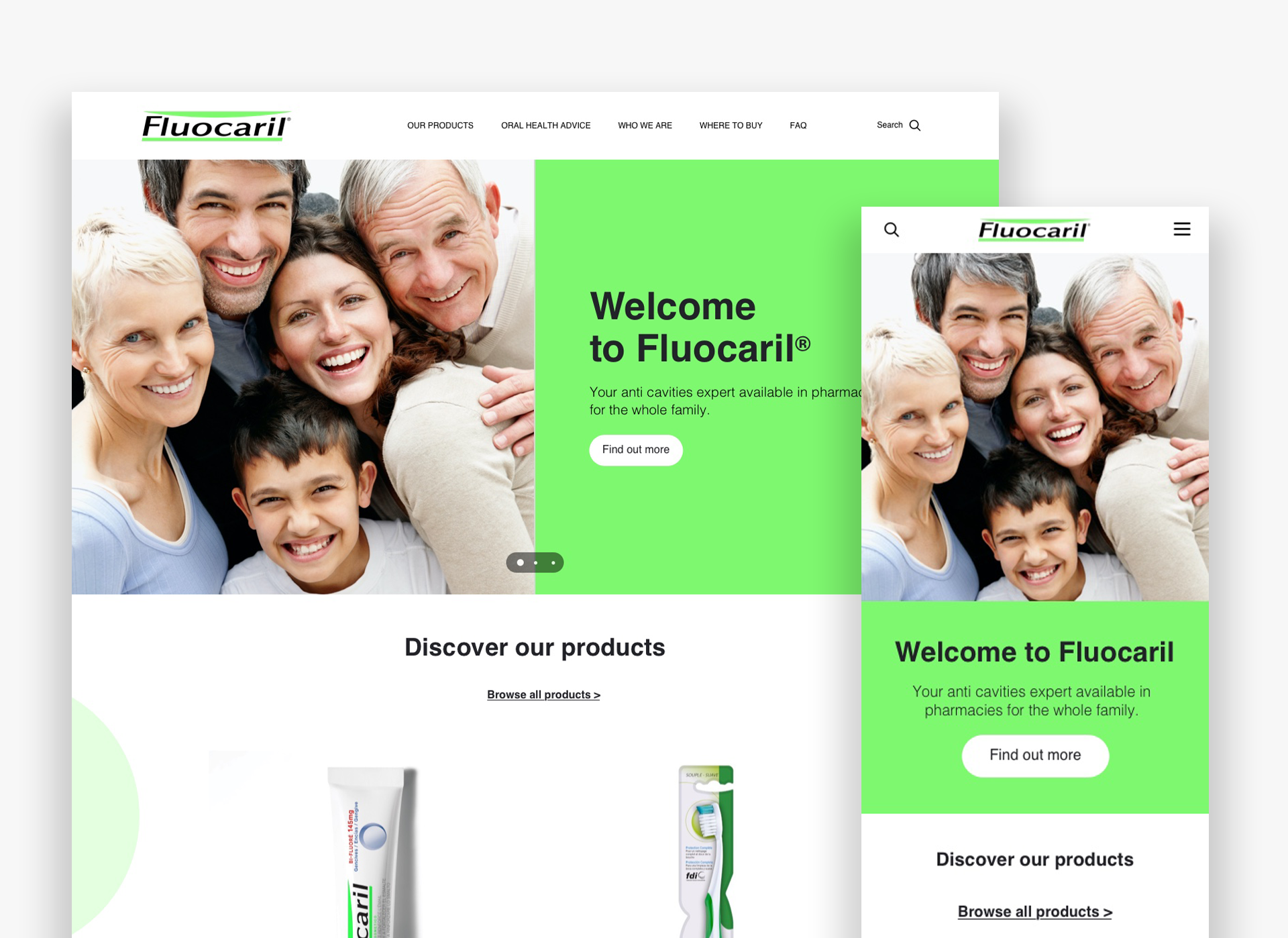
Client: Fluocaril
Role: Lead UI Designer
Duration: 4 Months
Tools: Pen & Paper, Figma, Google analytics, Content square, Miro
Responsibilities: Competitive & Comparative analysis / Persona creation /Content auditing / Presentation scriptwriting & design / User Testing / Low & High Fidelity Wire-framing prototyping / Data Analysis / New component builds for design system
Design scope
Update the look and feel of the Fluocaril website to align with the new brand guidelines using the French site as the master and make available for other markets.
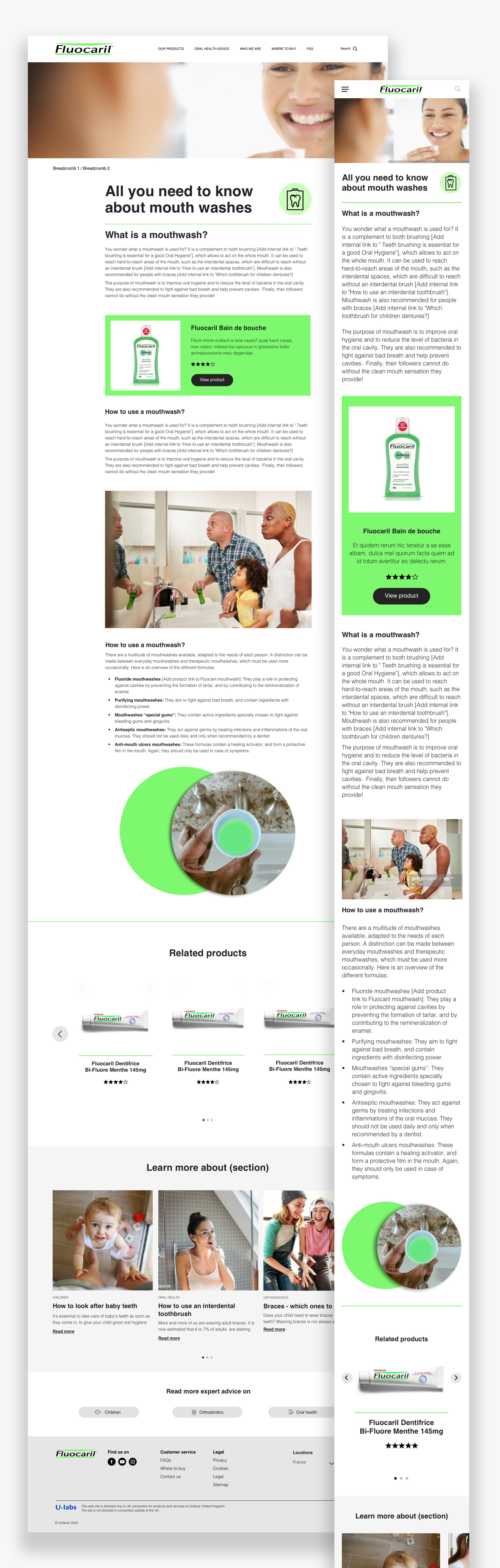
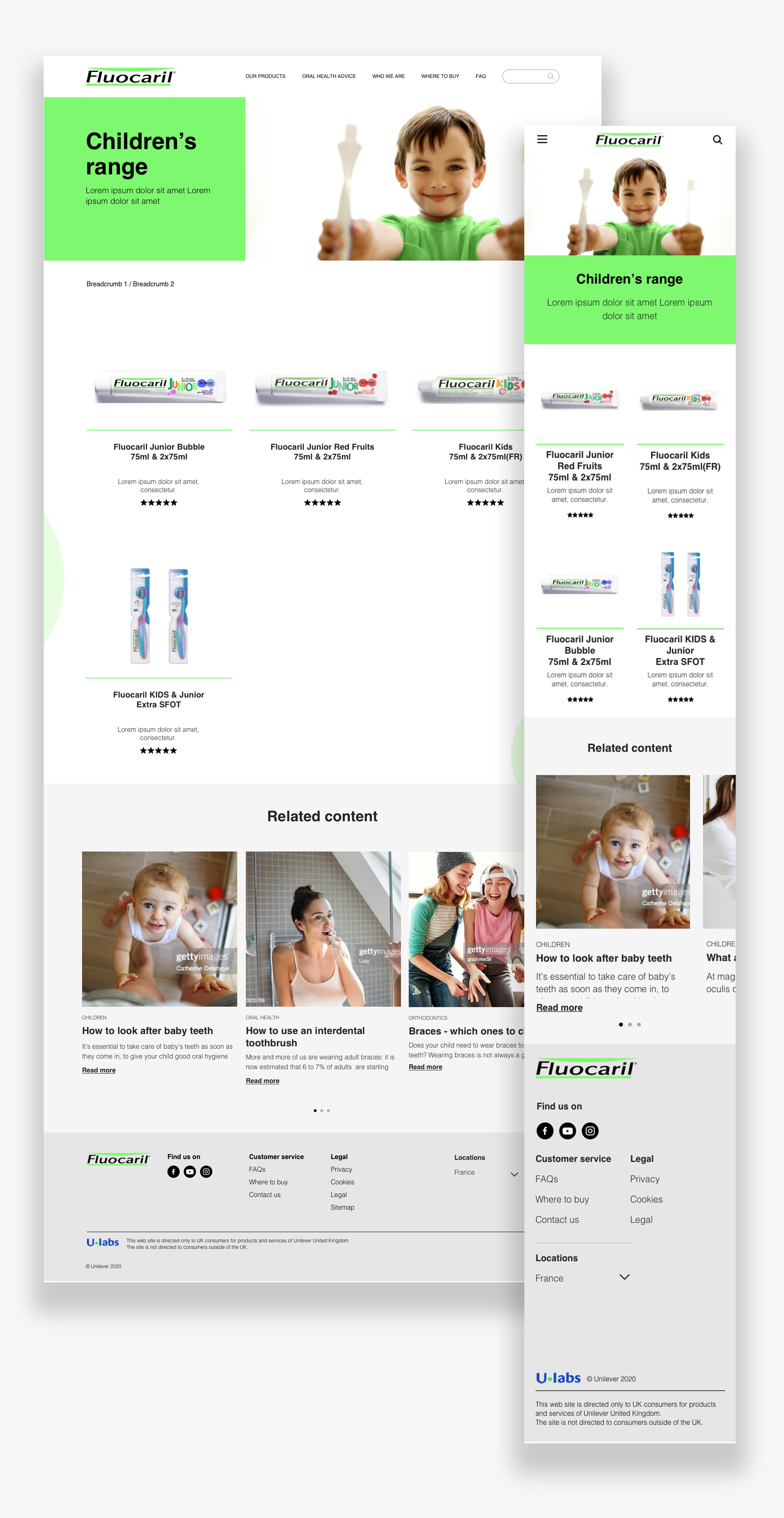
Site Structure, Look and Feel
Propose new layout, colour, iconography, fonts, and recommended imagery across the site
Article Hubs
Recommend and design an article hub (that can host 10-15 articles and supplementary content to drive site engagement
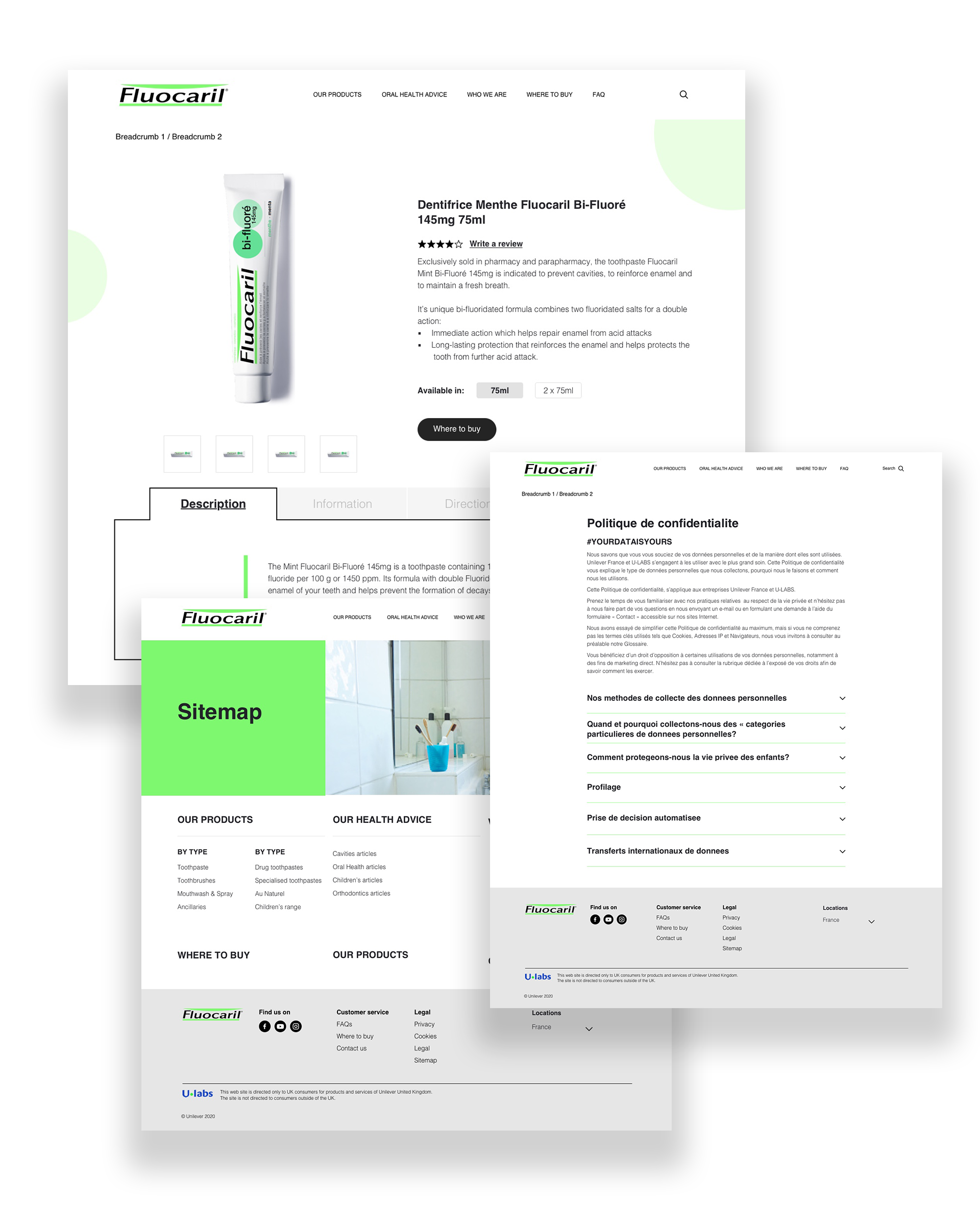
New Product Pages
Populate content for three product pages for the new product launches arriving in 2021
Brand contraints
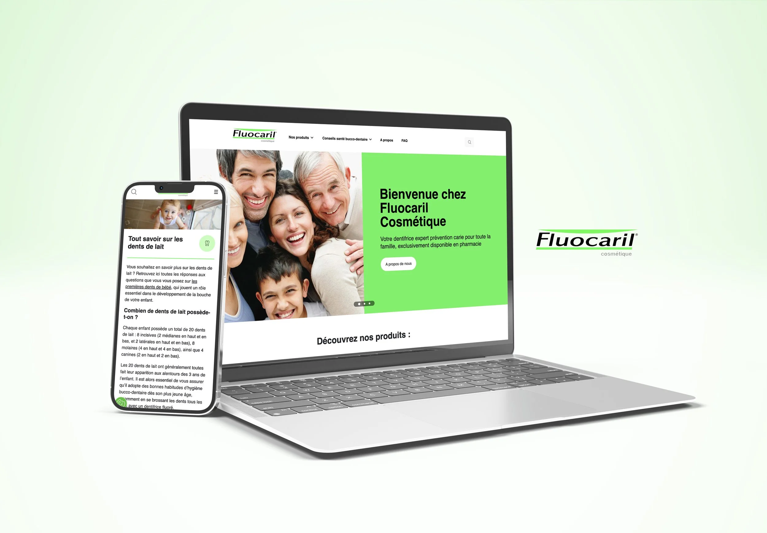
In France, Fluocaril is compounded of a cosmetic and medicinal range of products. The medicinal range is subjected to the French authority approval before going live. The related content page must be developed as part of the overall site development but hidden to the sight of consumers until further notice. The rest of the site can be accessible to consumers.
Ensure the site design showcase Fluocaril brand identity visual in-line with provided brand guidelines. – Please refer to Fluocaril Guidelines deck.
The regulation may vary by markets due to the status of the range/products; each market would need to ensure the site is compliant with their local regulation.
UX and Design must account for the latest CXX (internal consumer excellence standard) features including Buy-it-Now (BIN), Ratings and Reviews, Contact us, FAQ,
UX and Design must cater for multiple languages and special characters
Scope
Number of templates will vary based on UX direction
Wireframes and designs to be delivered for both desktop and mobile
The objective was to create a user interface design and flow that enhances the user experience.
Stage 1 - site structure review
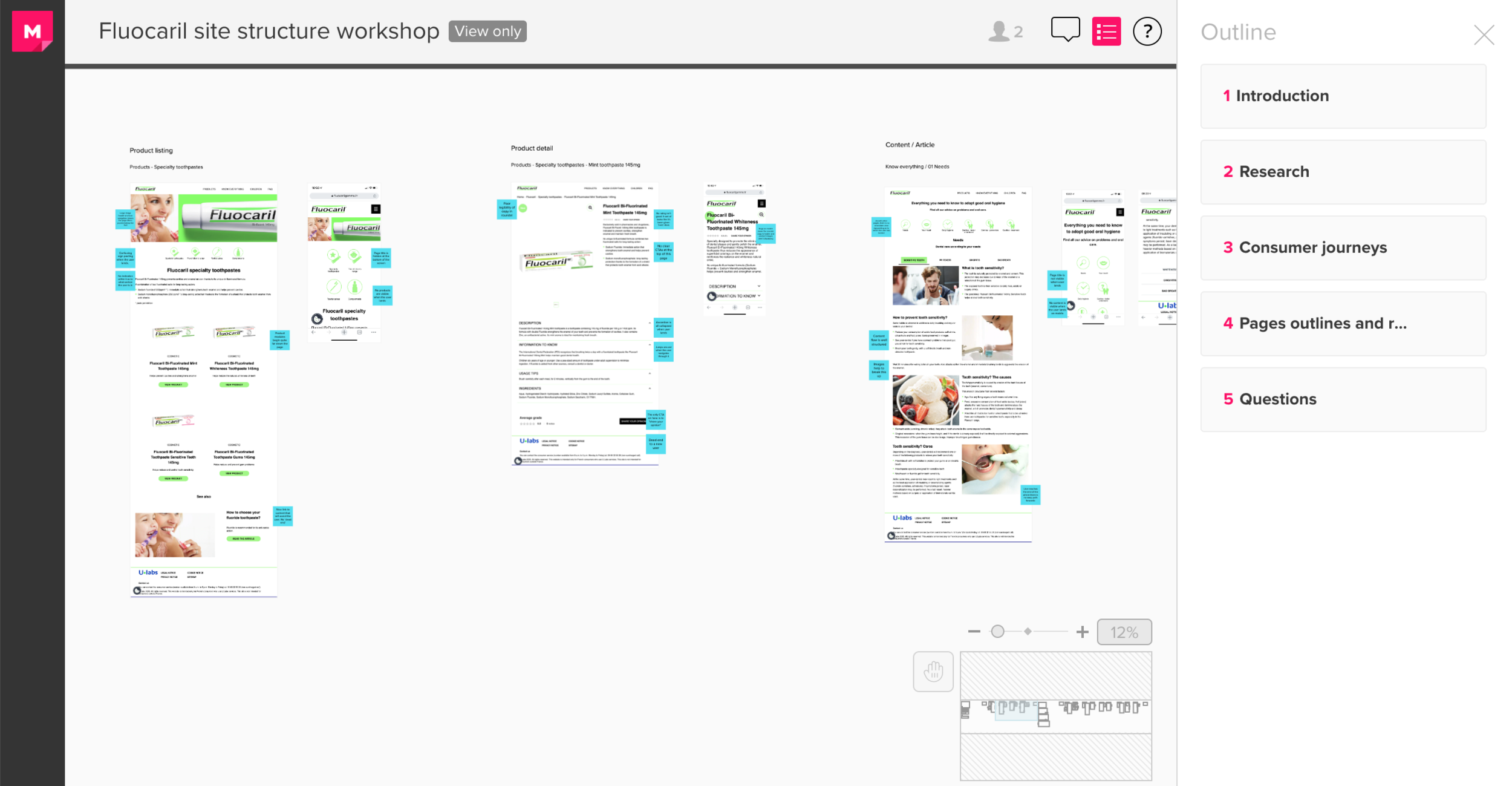
Site structure review & competitor research
Ux and Strategists first review the existing website, outlining site structure, pain-points and which components need to either be removed or updated. We then conducted in depth research across the competitor market.
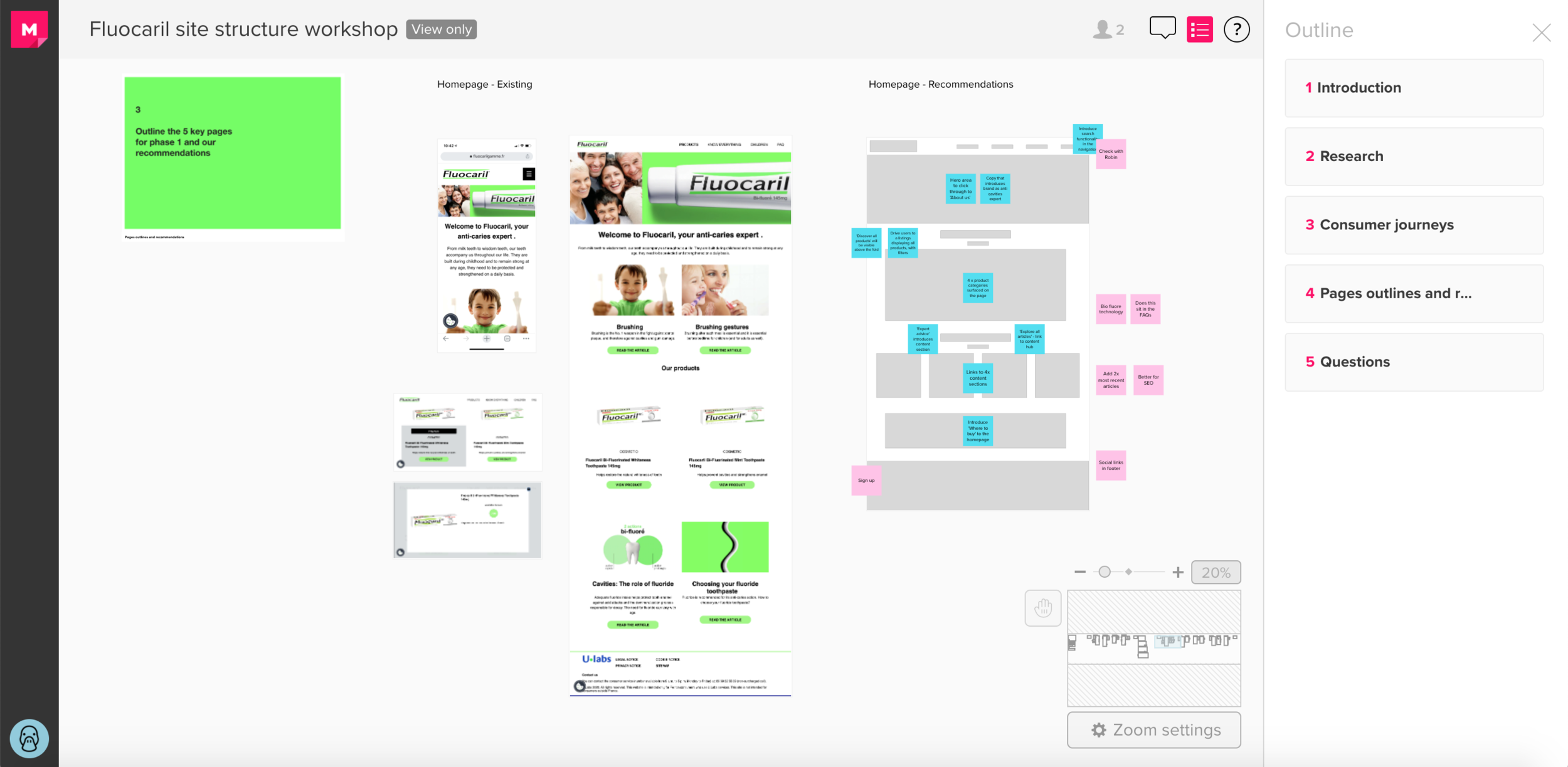
Content Mapping.
We used Mural to organise our thoughts and assist the teams real time collaborative visualisations and thoughts.
Stage 2 - Wireframing
Stage 3 - UI Designs
“The new design proposition will look at layout, color, fonts and recommended imagery (photography/renders) for the homepage, as well as other content pages (on both desktop and mobile), to set the tone for the implementation of the full website.”